THE PROBLEM:
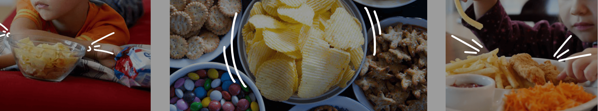
As most mothers will tell you, getting a kid to eat their meals is one of their greatest struggles. Our job was to find a way to get our brand to entice the kids into eating these healthy snacks while also assuring the mothers that it was good for their children.
Project year
2016
Client
The Mumum Co.
Project type
Food & Restaurants
Location
Mumbai
The Solution:
We wanted to create a brand that spoke to both mothers and children in a language that they could both relate to, and find relevant.
Mumum was started by two mothers who wanted a healthier option for their kids to snack on. When they realised that they weren’t alone in their predicament, they decided to create an all-natural, good-for-kids snack.
Our first port-of-call was mothers — we wanted to know what snacks their kids ate, how they picked snacks for their kids, when they ate these snacks, and everything else in between — basically study usage, attitude and purchase.
None of these choices were healthy, not to mention, that almost none of the snacks were actually meant for kids! And while feeding the child was a big concern for mothers, they didn’t have too many options. For ideas of the food, she depended on the tried and tested food items that the elders in the family and the mother’s friends knew of.
We found that the international market approach to branding similar products focused on talking to mothers about the health benefits of the products.
While back home in India, we realised that although there were some newer players entering the market for kids’ snacks, the focus on health was missing; and the few healthy products that did focus on health, did so far too seriously to be considered a kids’ snack in the mother’s mind. What we found more interesting, was that while the healthy snacks aisle was beginning to take shape, there was no sign of an aisle or a shelf for kids’ snacks anywhere on the horizon.
The Seed Idea:
Keeping with that sentiment, our design broke away from the expected. Instead of using one font, we decided to use a variety of fonts to create the brand’s logo. The colours and the way the letters come together with different forms and shapes, depict the energy and movement of the brand. The individual letters were designed to represent various members of an Italian family, in all their shapes, sizes and personalities.
All the primary research with mothers and kids and extensive discussions with the founders, helped us finally distill the truth of our brand. We decided to build the brand around the endearing bond that exists between a mother and her child. This became our seed idea and defined everything we did for the brand after.
Our clients had a working name for the brand — Mumum, and after our research we felt the name Mumum fit the idea perfectly. It clearly referred to food (by infants and even toddlers), and hinted at the founders in a way. We tweaked the name to make the brand clearer as an entity and to comply with legal requirements, calling it The Mumum Co.
Defining the Problem:
Discussions we had with mothers made it clear that every mother goes to great lengths, suffers tantrums and performs theatrics to get her child to eat.
And that’s when we wondered — what if our brand could actually make the child want to eat? We were now solving two problems with our brand design:
1. Make the child want to eat → Our brand should talk to kids
2. Assure the mother that this is good for the child → Our brand should talk to mothers
We wanted to be an honest but lighthearted brand that encouraged the child and the parent to have fun.
Brand Design:
Once we convinced our clients that this is what we should do, we moved on to designing the brand.
To kickstart the process, we turned to our end-consumer — children! After spending our time watching, observing and playing with them, we knew that if we wanted to make Mumum attractive for kids, we needed to speak their language, in every way we could. Because kids don’t see things the way we do, we had to look at things the way kids would.
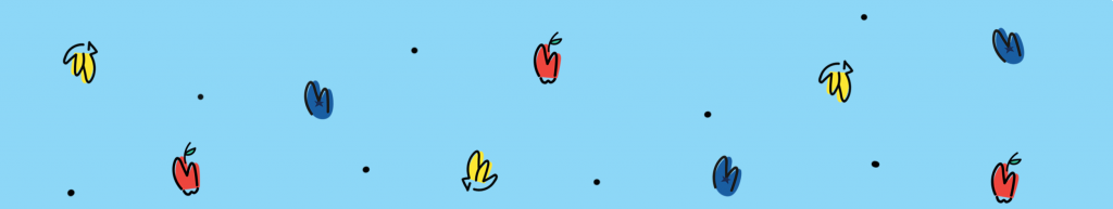
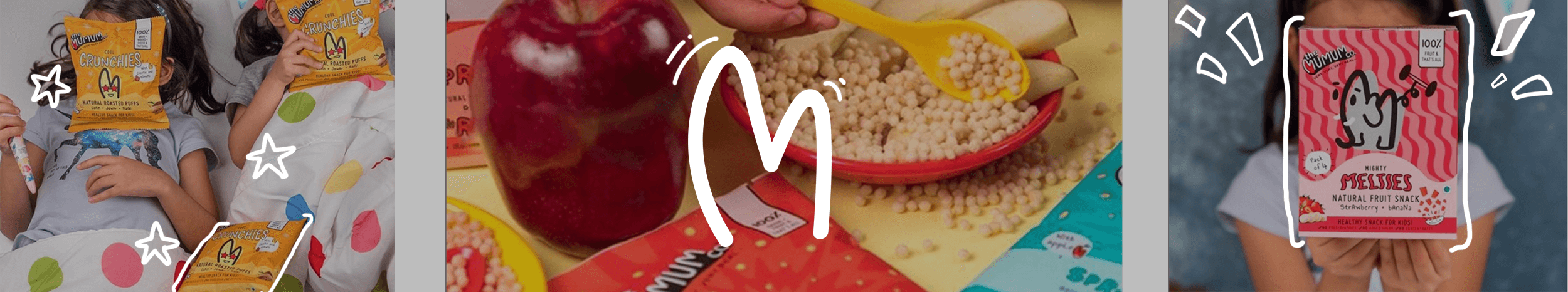
For our visual language, we explored all the ways in which mothers interact with their kids before we found ourselves gravitating toward doodle drawings. We used a doodle style M from Mumum to create unique representations for our product ingredients and brand attributes. This was a powerful route, as it meant that even if we wanted to represent something like carrots, we could do it in a style we could own so that kids could relate to it and mothers could see exactly what her baby was eating.
For the main brand identity we took the M of the logo and turned it into a heart to emphasise the love between mums and their kids. The M and the heart, also became the most responsive part of our logo, turning into characters, animals and ingredients to engage with the imagination of kids.
Our verbal language was based on the way kids speak. Literary devices like repetition, alliteration and language that is colloquial for children in general, came to define our verbal style.
It’s rooted in exaggeration, creating a world that’s bigger than a child knows. Hence, the tagline couldn’t be ‘Very Real’; it had to be ‘Very Very Very Real’!
The simple language also made it easier to break down all the ingredients and processes in a lucid and easy-to-understand manner for the mother to read while still retaining the brand’s lighthearted and fun elements.
Packaging Design:
From our past experience and our primary research, we found that the best way to understand a product is through its texture, shape and taste.
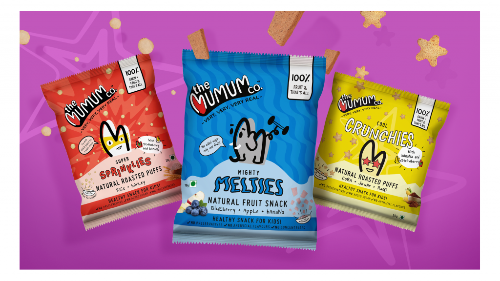
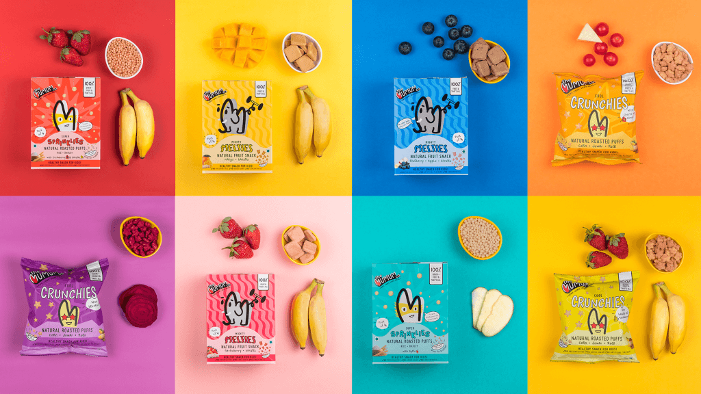
And that’s how we came to name the Mumum product lines — Melties, Crunchies, Chewies and Sprinklies. Since our brand language centred around children, we needed to ensure that each texture variable name was distinct enough from the other.
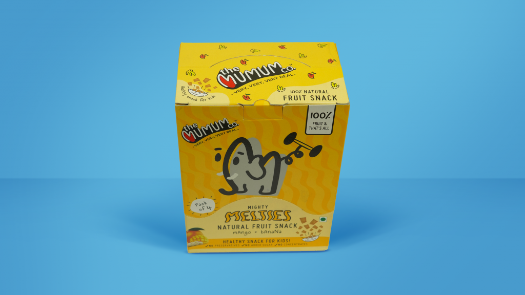
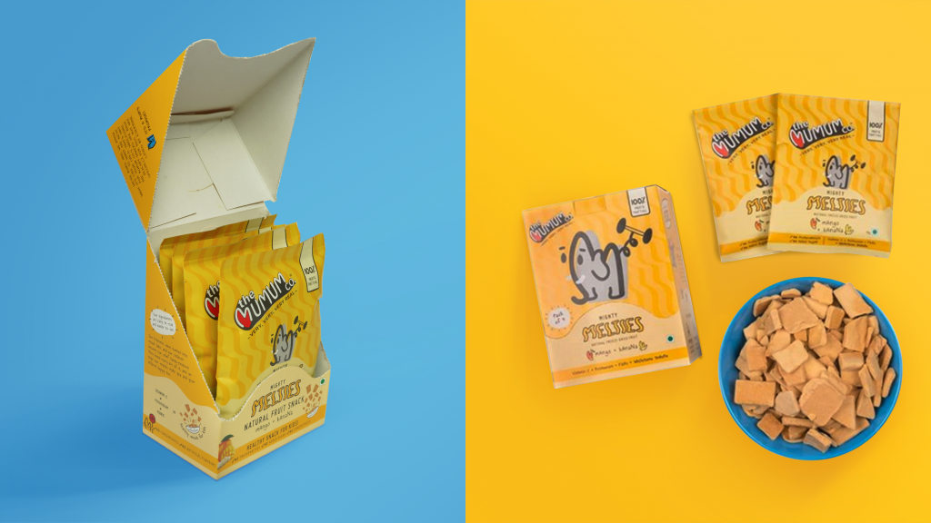
To this end, we created characters that personified each product line on the front of the pack. Eg. Melties got an Elephant to own the mightiness! The typography of the product name, and the patterns were also inspired from the texture of the product.
On Shelf:
Since there was no real category for children’s snacks in most shops, we needed the product to stand out that much more when stacked on shelf along with other health food products.
When our client expressed their idea of creating a multi-pack that could also double up as a ready shelf unit, we designed what we like to call the ‘retail-ready tray’. The design of the tray served a dual purpose — a retailer could sell this as a multi-pack of 4 bags, but they could just as easily tear off the top and use it as a tray for individual bags. The multi-pack later became the main SKU for our online channels. The pack of 4 made it more practical for consumers to buy online, and also easier for online players to manage efficient delivery.
Happily Ever After?
A strong brand language enabled the brand to stand out across touchpoints — pop-ups, on-shelf, website, etc.
We don’t necessarily believe in fairytales, hence we are always learning, and striving to do a better job. Which is why we’re still making minor revisions to our designs, and are in the process of extending the range to include more products that will appeal to more consumers.