THE BACKGROUND:
Ananda is an award-winning luxury destination spa & resort situated at the Himalayan foothills in Northern India. As one of the finest luxury wellness retreats in India, it integrates traditional Ayurveda, Yoga and Vedanta with international wellness experiences.
Project Year
2015
Client
Ananda
Project Type
Fashion & Beauty
Location
Mumbai
The Objective:
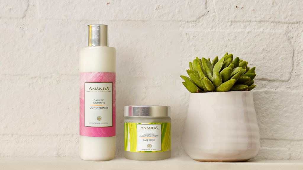
Ananda was looking to expand into retail with their existing range of oils, creams, scrubs, lotions and hair products that were currently only used in their spa. Our objective was to create a design and packaging structure that could be extended into B2C retail and into their line of products.
The Solution:
Ananda as a brand emphasises being at one with nature, promotes ancient Indian practices (through the concept of chakras) and takes you back to when holistic living was a way of life. However, we soon noticed that while chakras evoke emotion and make consumers feel a certain way, what draws a consumer to a cosmetic product is its texture and the way it feels when interacted with.
We therefore used varying textures and colours based on the product and its function – softer colours and textures were used for moisturisers, while scrubs had a deeper, rougher texture on their packaging.
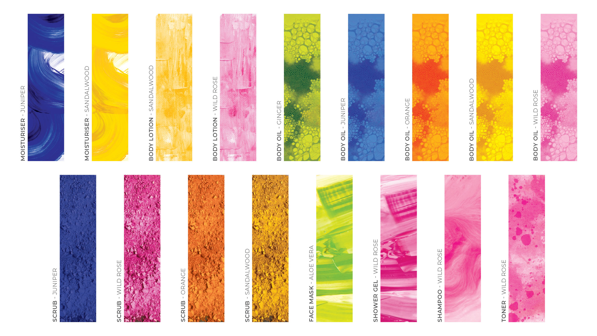
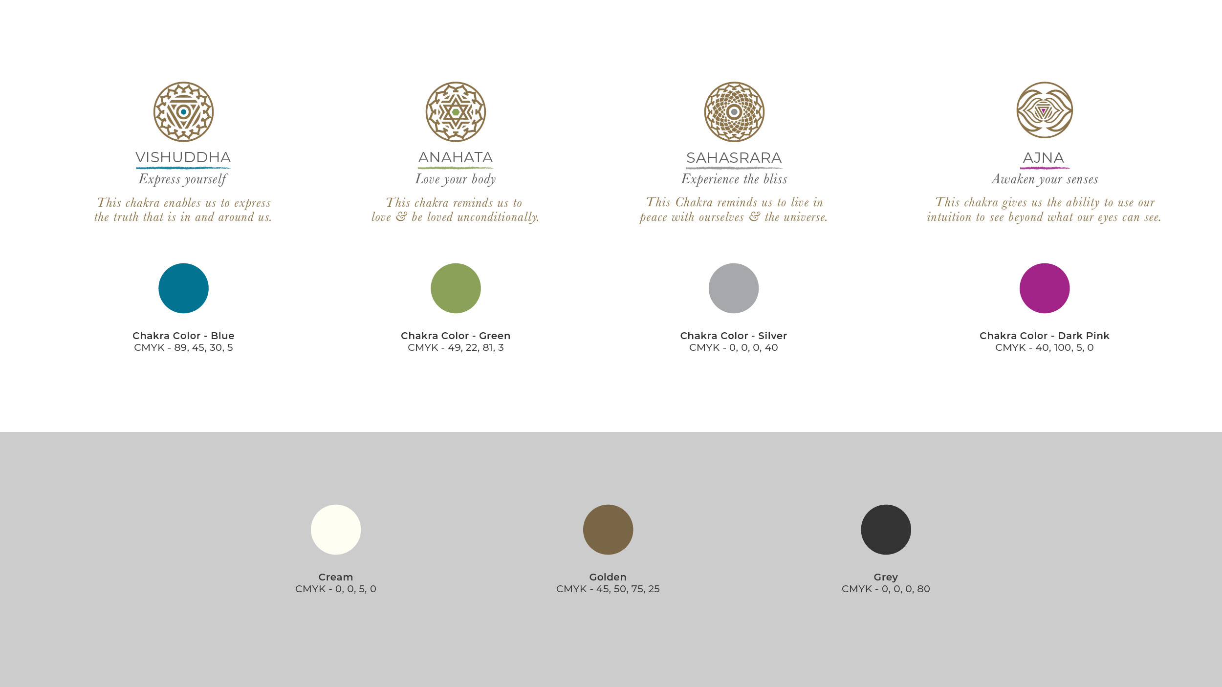
Since we didn’t want to do away with Ananda’s focus on chakras, we decided to extend the number of chakras we highlighted from 4 to 7, to associate each product category to a specific emotion, scent and ingredient.
We also had to ensure that our packaging and design encouraged consumers to purchase treatment packages and not just individual products. To accomplish this, we added numbers to each product and product package, making them more relatable, giving them a more youthful feel and also assisting in the purchase of treatment packages.
To tie it all together, on the inside cover of the packaging, we verbally communicated how each chakra should make the user feel. This brought in an element of physical interaction with the product, that gave consumers an added sense of positivity and made them feel like they were being taken care of.
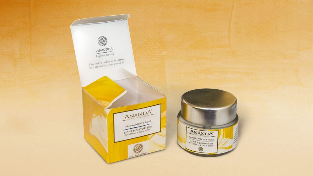
We were finally left with an amalgamation of elements that were visually engaging, in line with the brand’s ethos and told our story effectively.