PROBLEM TO SOLVE:
To change the perception of Nivea from an everyday essentials brand to a brand that people would consider a fun gifting option.
Project Year
2018
Client
Nivea
Project Type
Fashion & Beauty
Location
Mumbai

The Solution:
To create a gift box that pushed Nivea to go beyond the traditional blue in order to create something that stood out and was relevant for their target audience.
The first thing that comes to most peoples’ mind when they think of Nivea is “daily essentials”, not gifting. That’s where we came in. Our job was to design a Nivea gift box for women that people would want to give to their loved ones over the festive season.
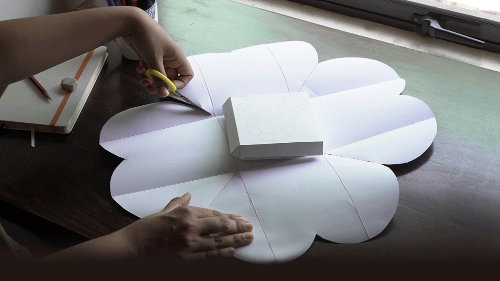
The insight that most excited us about a gift box was the feeling of joy you get when you unwrap a gift and that’s the feeling we knew we needed to translate into this gift box. In order to create this feeling, we decided to not only design the outside of the box, but to actually engineer the box from scratch to get the impact we wanted.
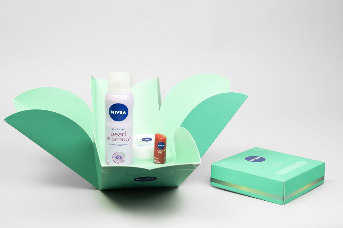
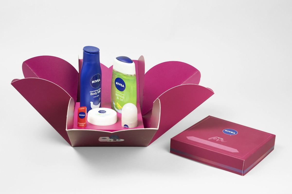
Engineering a box from scratch came with its own set of challenges; it had to be beautiful, but it also had to be practical, strong and sturdy enough to survive transport and stacking on shop shelves. We explored multiple directions before finally settling on the design for a box that would open like a flower to reveal the Nivea products inside. The flower was a perfect representation of the beauty we were looking to create and the soft touch of care that lies at the core of Nivea, the brand. The cherry on top, was adding a sign-off that said “With love” leaving a blank space for the person gifting the box to handwrite their own names. Thereby adding their own personal touch to the gift box.
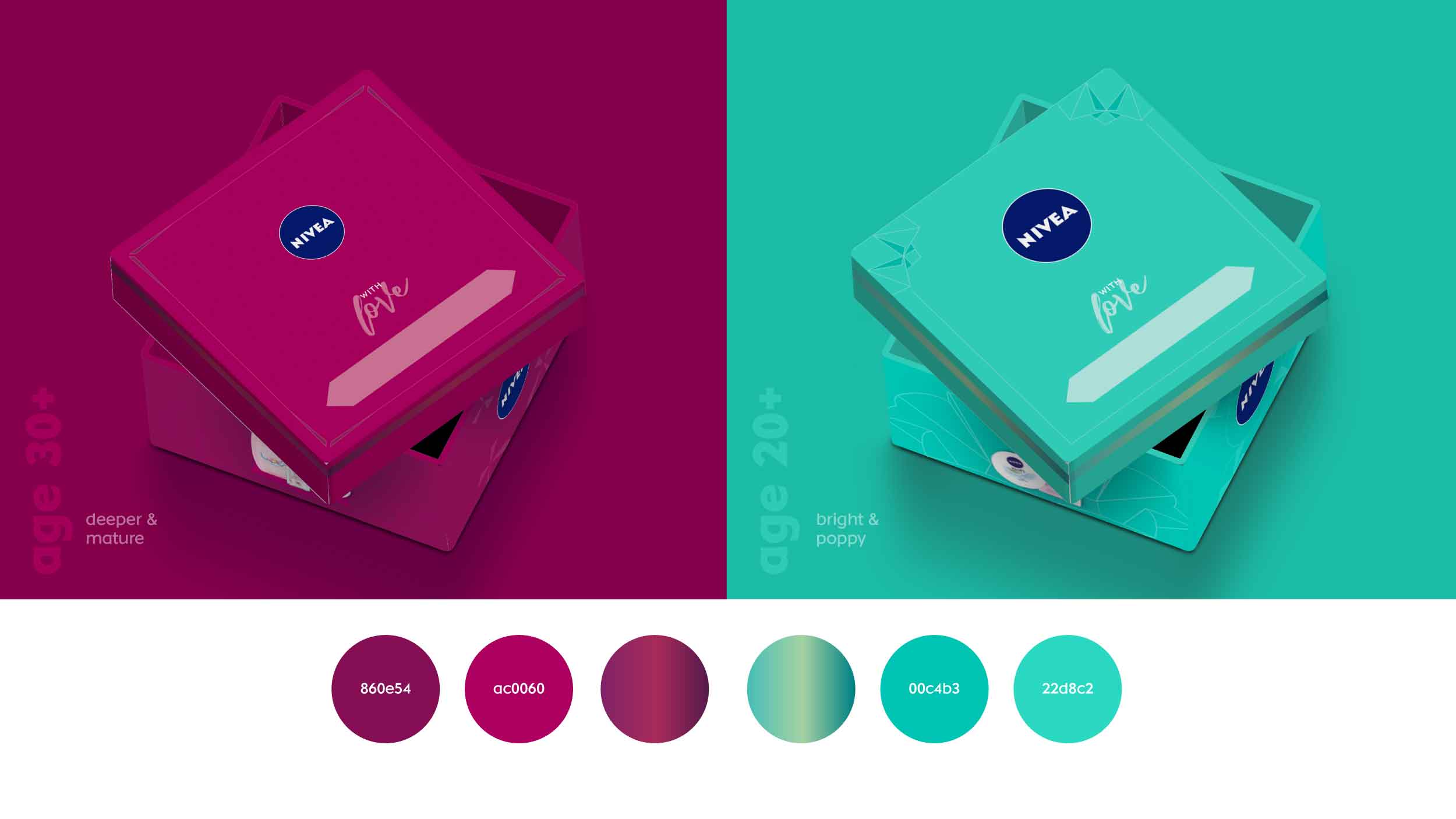
A lot of thought and research went into choosing the right colours for the gift boxes. We made a conscious effort to not use Nivea’s traditional blue and chose instead to use a deeper, more mature red for women in their 30s or older; and a bright pop of teal for the younger women.The geometric pattern on the outside of the box represents a burst of light, the centre of all festivities filled with brightness and joy in India.
At the end of all our research and design, we successfully managed to break away from Nivea’s traditional outlook to create a box that was brighter, more emotional and definitely more gift-worthy.

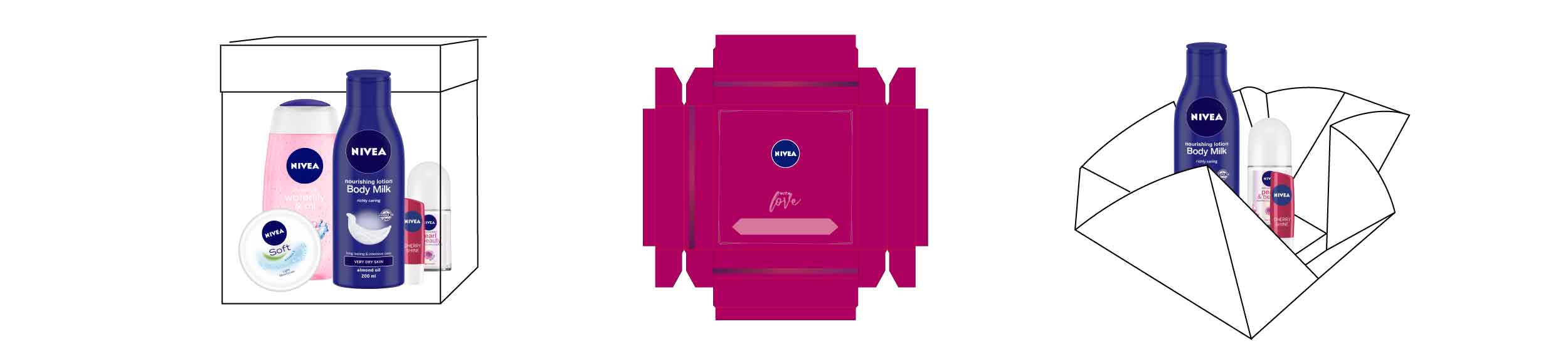

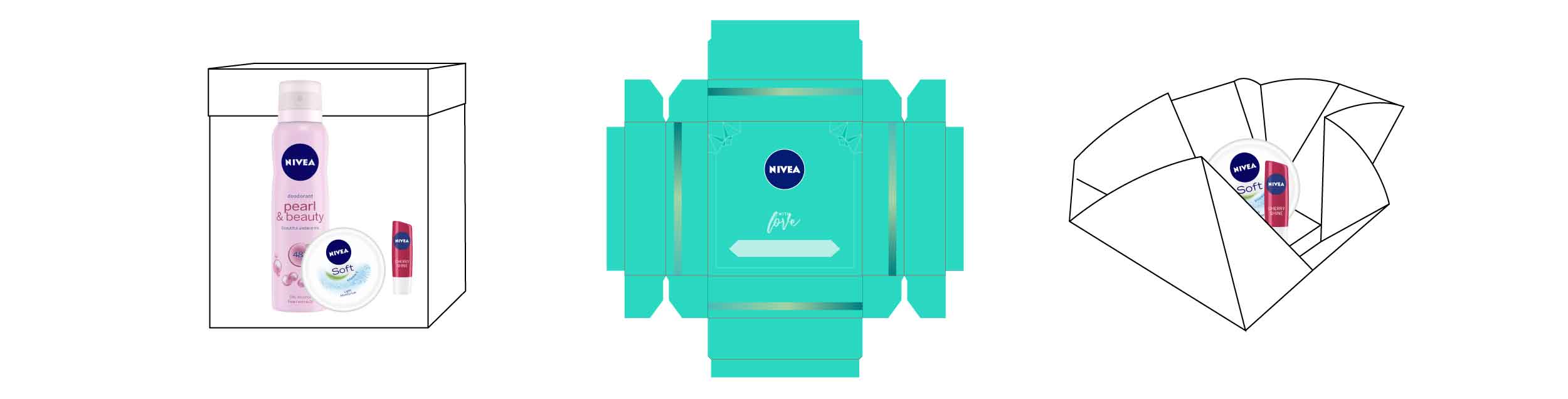
We proposed two colours for the gift boxes for women. We assigned a deeper, mature red to the box for women aged 30 and above and a bright, popping teal for younger women. In addition to being aesthetic, the box had to be strong and sturdy to survive transport and stacking on shelves.