THE BRIEF:
IIFL, launched in 2008 had grown to become the leading wealth management company in India, and by 2015 had built 7 additional subsidiaries offering various financial services. Our task was to create a distinct identity for the parent brand IIFL Wealth, as well as a language that could be adapted to all its subsidiaries.
Project Year
2016
Client
IIFL
Project Type
Banking and Professional Services
Location
Mumbai

The Problem
With IIFL’s rapid expansion, we noticed that all the subsidiaries had grown in isolation, lacked consistency in brand language, and required an overall brand architecture.
There was also a gap between the services offered and the positioning that IIFL Wealth was communicating to its clients. The brand had premium offerings, and multiple subsidiaries providing more than just wealth advisory services, however, these offerings were not branded or communicated clearly.
The Approach
Our goal was to give IIFL Wealth a strong brand positioning and identity that communicated its values and proposition to external clients as well as internal stakeholders.
We also decided to design a brand architecture for all its subsidiaries. One that gave them a distinct brand language and voice of their own, but still stemmed from the same roots as the parent brand.
Another element we analysed was the name of the brand. Since it was offering more than just ‘wealth management’, we needed to give it a name that encompassed all the financial services the brand offered.
The Solution
We began by analysing all the services IIFL Wealth offered in order to come up with a name that encompassed them all. Since the services ranged from Wealth Finance and Trustee Services to Asset Management, we settled on the name ‘IIFL Wealth & Asset Management’.
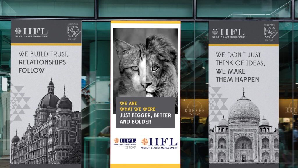
We also designed a logo for this brand that would then be adapted into the brand architecture for each subsidiary. We used a deeper blue to bring out the strength and sophistication of the brand while using a more contemporary typeface that emphasised progressiveness and confidence.
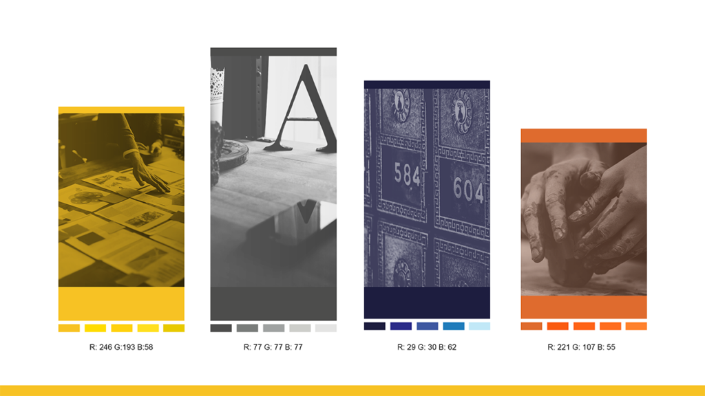
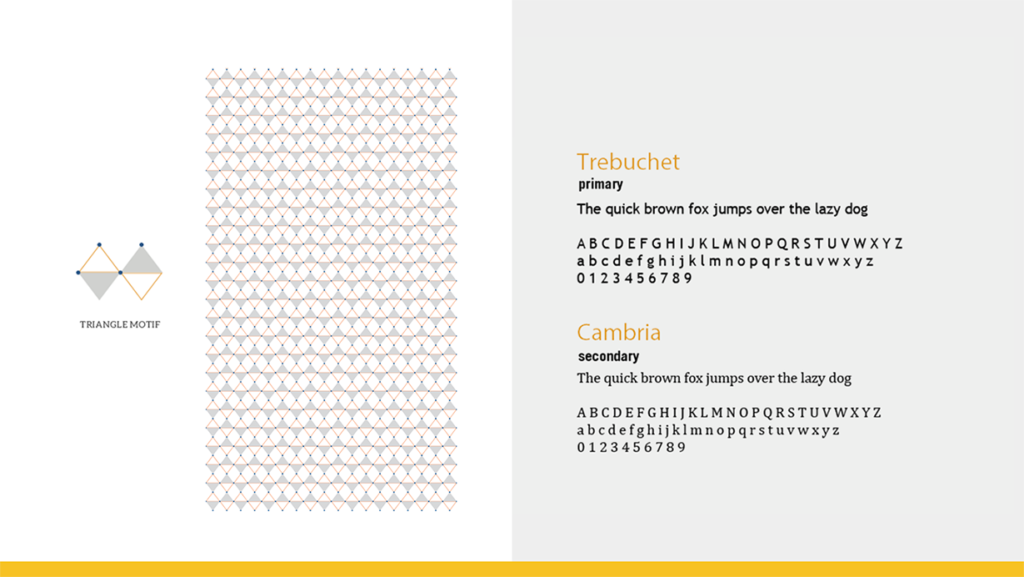
We then moved on to the visual and verbal language for the brand. With regard to the typography, we chose sleek, elegant and contemporary typefaces to make the brand more modern, sophisticated and approachable. We also used shades of blue, orange, yellow and grey to evoke a sense of positivity, authority and practicality within clients.
Since IIFL Wealth & Asset Management was here to make wealth management easier for their clients, we ensured our verbal language was smart and professional, while still remaining inspiring and emphatic. This made the brand knowledgeable and experts in their field, but not one that is overwhelming to the consumer.
As the brand’s positioning and core beliefs were not clearly defined, we dove into IIFL’s brand wheel to analyse its ethos and brand values. Defining these was key for us to start establishing the new positioning for the brand. After carefully analysing what the brand stood for, we arrived at six core values: Transparency, Adaptability, Progressiveness, Expertise, Invested, Demystification.
These values now had to be clearly communicated both internally and externally.
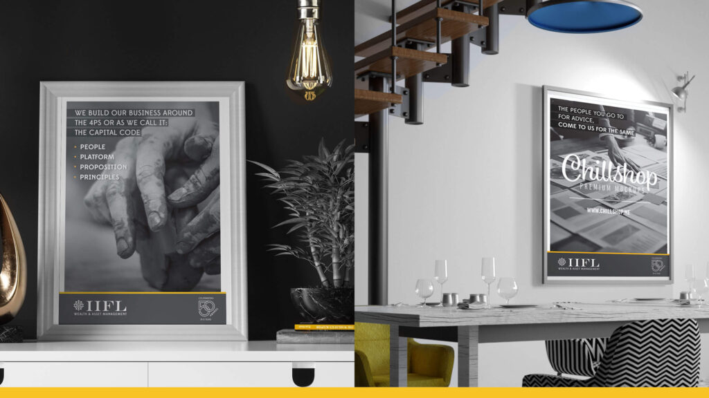
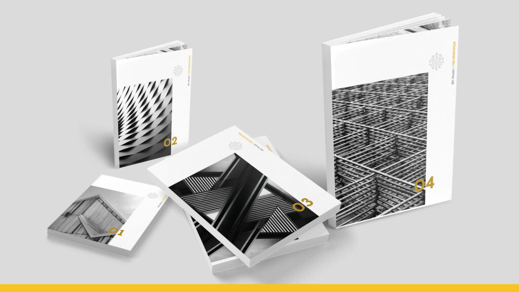
The Capital Code
We therefore created The Capital Code. This brand brochure not only listed out the values and vision of the company for internal stakeholders, but was also instrumental in standardising the sales pitch made by IIFL’s sales team. It could be given to clients after meetings for further reference, thereby clearly communicating the values and proposition of the company to each stakeholder.
The Launch
The new brand was launched with email communications from senior management to the entire company, along with a letter from business partners explaining how the company had grown and why the change was necessary.
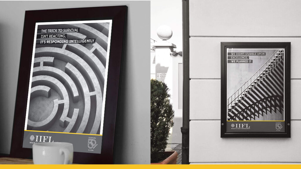
Branded stationery and other collaterals were left at employees’ desks, the walls were painted with the new brand colours and premium looking logos adorned the organisation. We also designed new office posters, standees and banners to create more of a buzz. This generated a lot of excitement about the rebranding and ushered in a new and prosperous phase at the company.