Project year
2021
Client
Blue Tokai
Project type
Food & Drink
Location
India
What did the brand need help with?
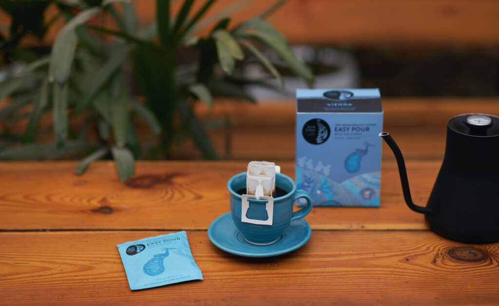
Blue Tokai was venturing into a new territory. They created a product for the supermarket shelf, the first time any of their coffees would be sold outside their chain of cafes or website.
They approached us to help extend their current brand language onto this new product packaging.
How did we get our hands dirty?
Based on our research (which also involved hours at various supermarkets) and strategy, we expanded the scope of the product, to compete with other premium coffee brands on shelf. This would help us widen Blue Tokai’s consumer base.
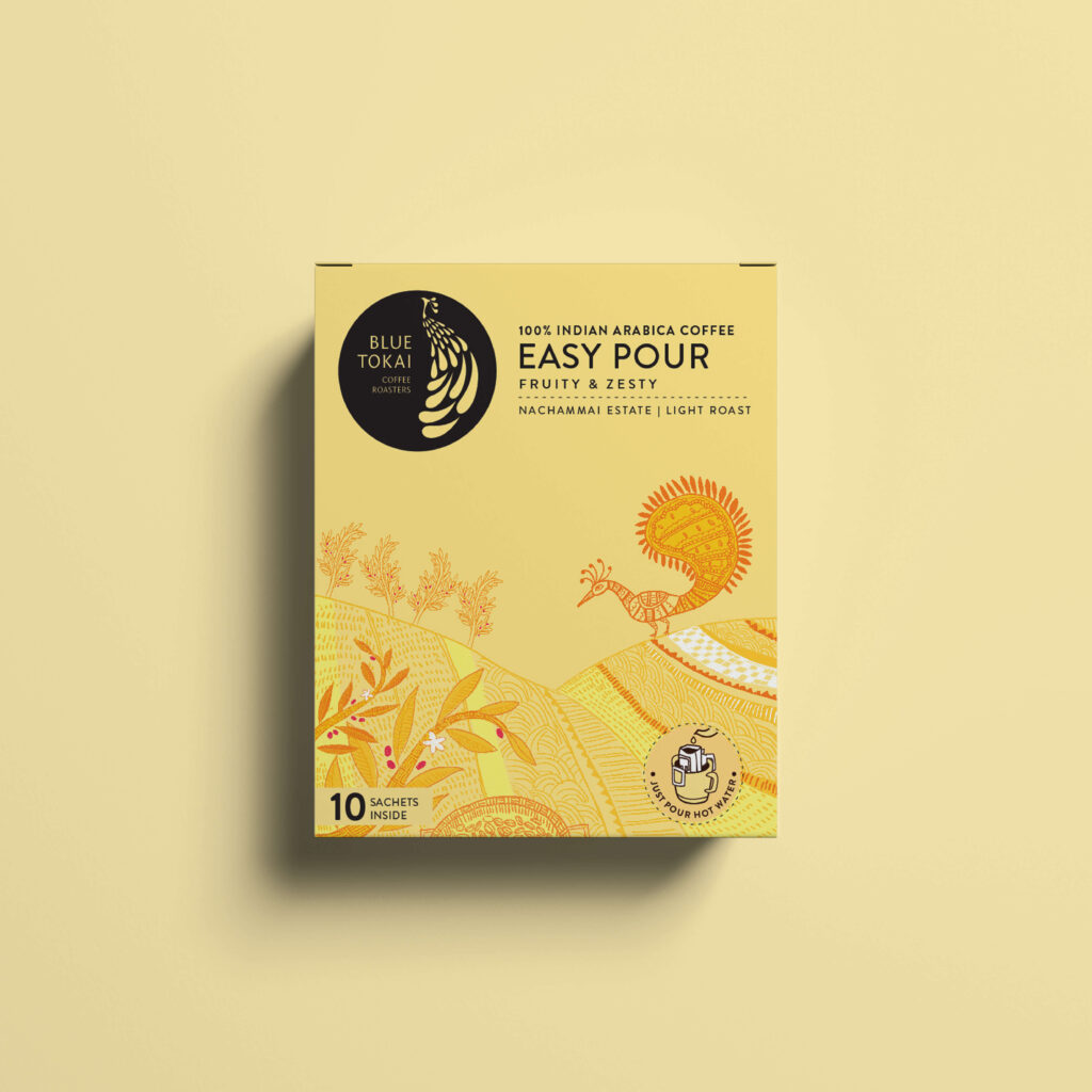
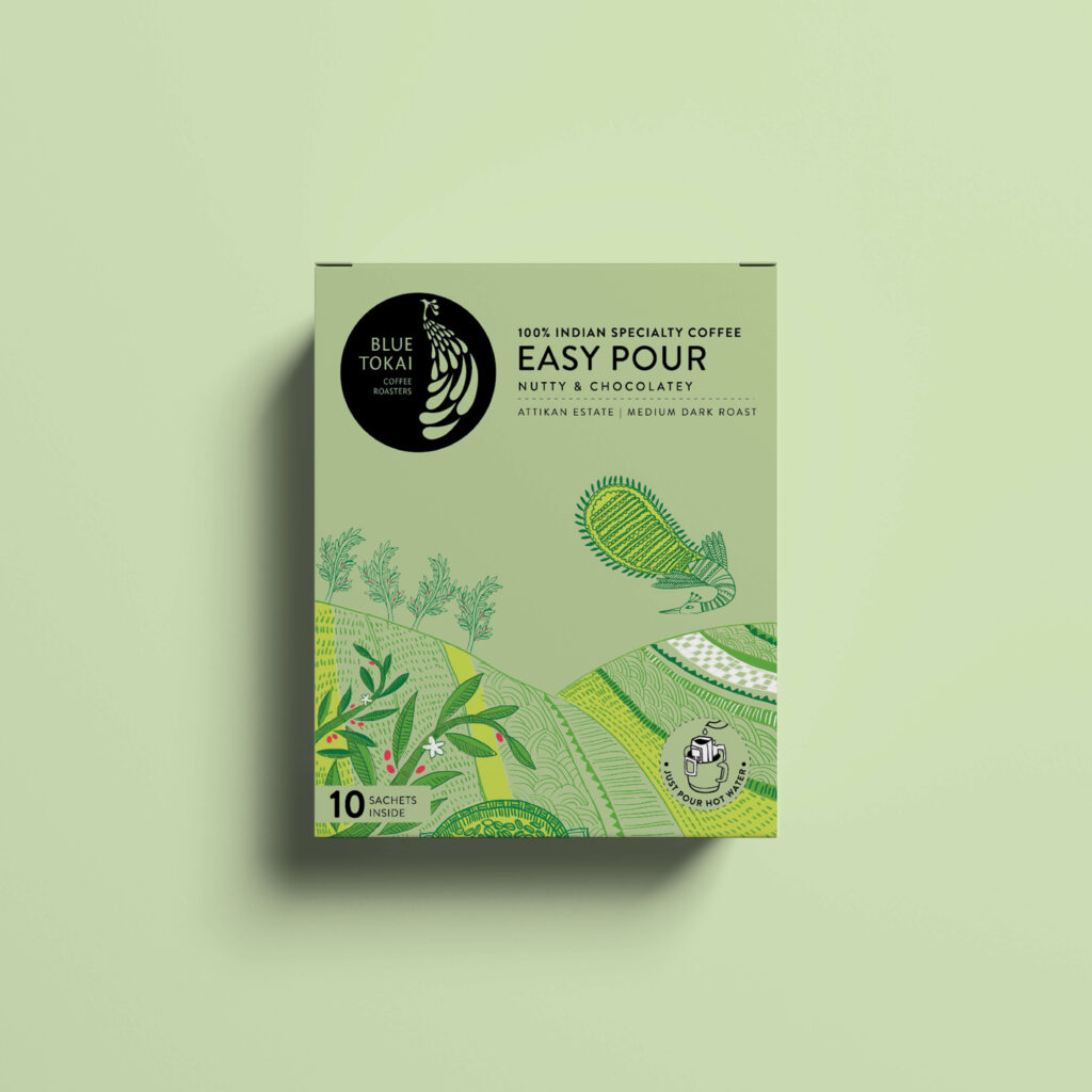
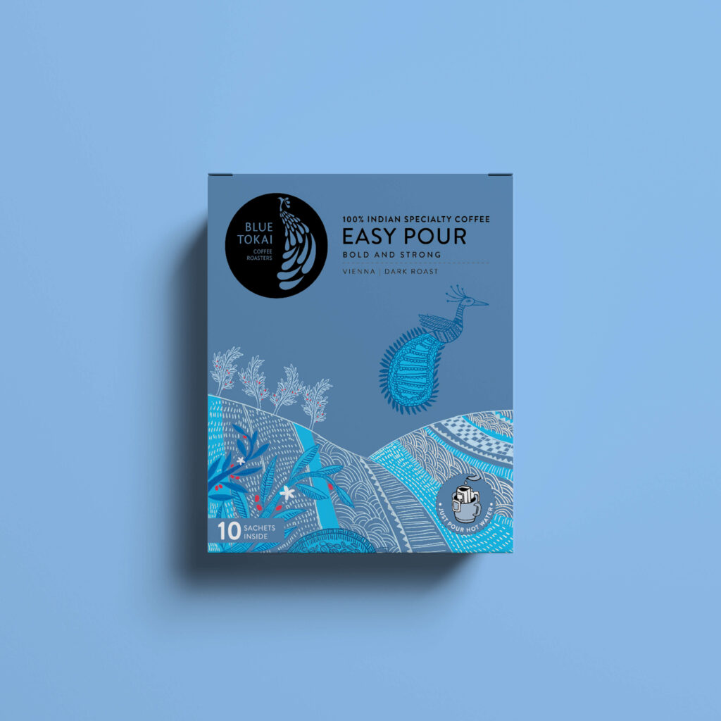
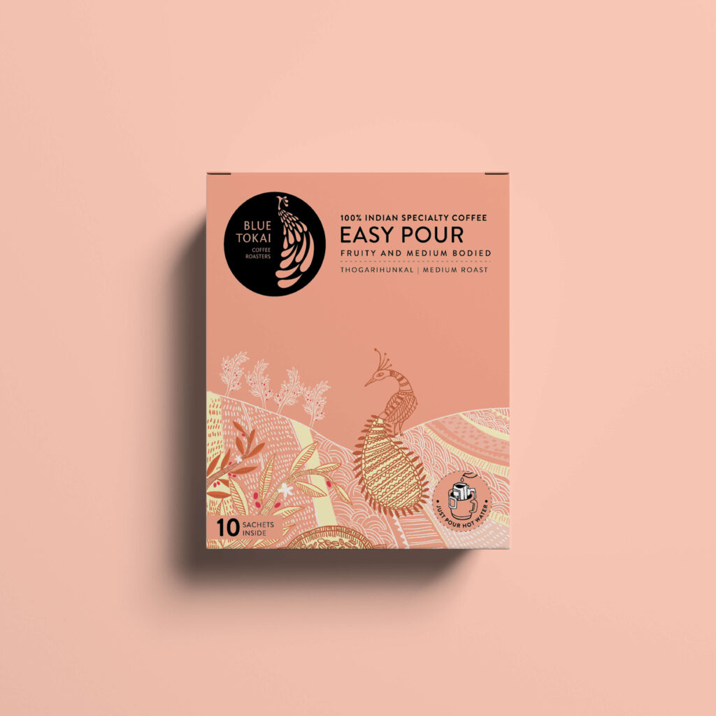
To compete on shelf, (both digital and physical), we pushed the brand to use more colour in the packaging, in order to stand out. A first for the brand.

Where did we sow the seeds of smart design?
Blue Tokai had the advantage of being a trusted brand, a trust they’ve established through their cafes. We leveraged this promise of quality by extending their existing design language on the box.
We then played up the word ‘Easy’ in the communication so as to cue convenience in the mind of the consumers. Not just convenience, but also that they were bringing quality to their homes and offices by getting the Easy Pour.
Has the brand moved any mountains?
The Easy Pour had a timely launch that coincided with the lockdown. As a lot of consumers brought the Easy Pour home the sales outdid their expectations.
What were the things we did for love?
To tell this rich story of provenance, process and taste, we focused on the illustrations and colour of the packaging. We combined Gond and Kalamkari styles into one artistic composition that echoed the beauty of Indian coffee farms.