THE PROBLEM:
CinCin, prounounced Chin Chin, is an Italian restaurant and bar that wanted to give Indians a taste of an authentic Italian experience.
OUR DIRECTION:
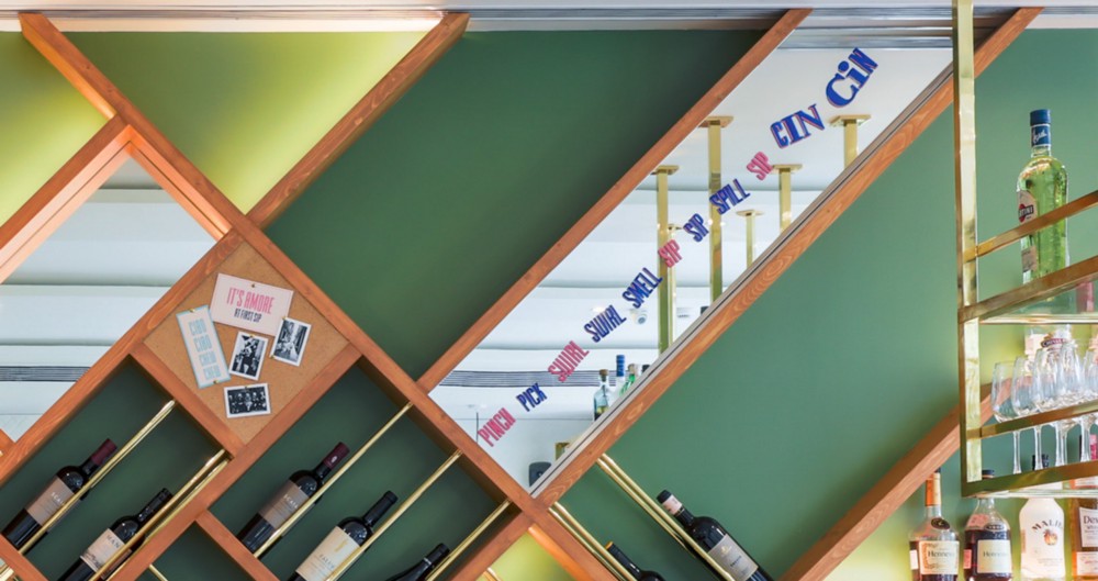
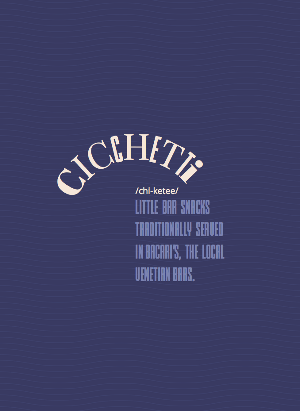
Unlike most brands that would use a foreign language to stay a cut above the rest, we decided to incorporate Italian in a more inclusive way, by giving pronunciation cues and even explaining how these phrases are relevant to everyday life in Italy.
Project year
2017
Client
Cin Cin
Project type
Food & Restaurants
Location
Mumbai
Our clients are well-established restaurateurs who cater to the discerning Indian customer with their brands such as Yauatcha, Hakkasan and Nara Thai, all of which are brands they have brought to India. When they wanted to build their own from the ground up, they approached us knowing our strength, which is to look at brands through a fresh and unconventional perspective.
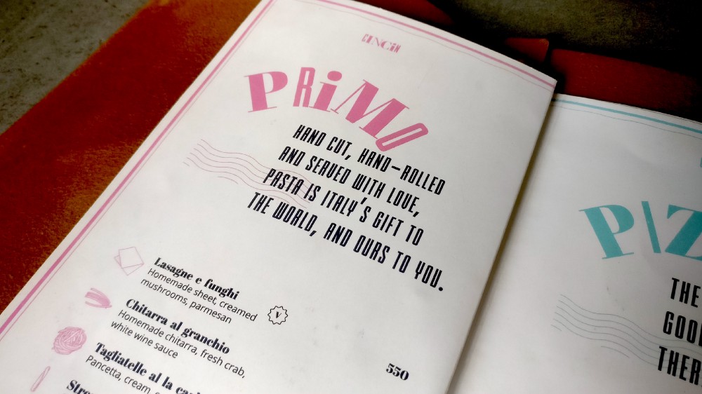
When building out a restaurant concept, there are multiple directions we could have taken. We could focus on new types of Italian food — in this case cicchetti (Italian small plates). Or build out a traditional Italian pizzeria concept, where the consumer is transported to a time and place.
After numerous hours of research, deliberation and ideation, we drove the team to design out a feeling. The concept we set out to design, was a restaurant that provided a vibe that was energetic, exciting, passionate and fun. We aimed to serve the neighbouring corporate community with a modern and fun Italian experience, that resonated with the upwardly mobile.
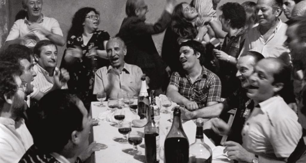
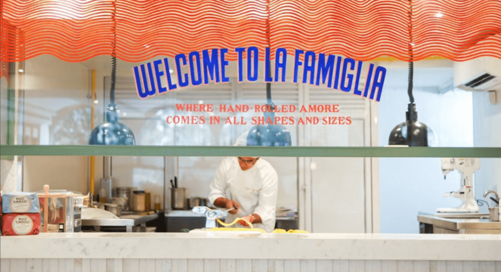
This picture, says everything we wanted the brand to be
INSTEAD OF GOING THE TRADITIONAL WAY OF PORTRAYING ITALY, AS A GODFATHER MOVIE, WE WANTED TO SHOW IT FOR WHAT IT IS TODAY. FUN, EXCITING, COLOURFUL AND AUTHENTIC.
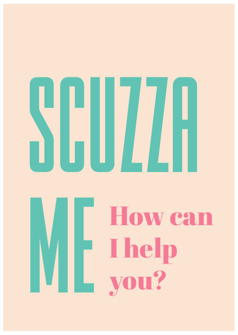
Keeping with that sentiment, our design broke away from the expected. Instead of using one font, we decided to use a variety of fonts to create the brand’s logo. The colours and the way the letters come together with different forms and shapes, depict the energy and movement of the brand. The individual letters were designed to represent various members of an Italian family, in all their shapes, sizes and personalities.
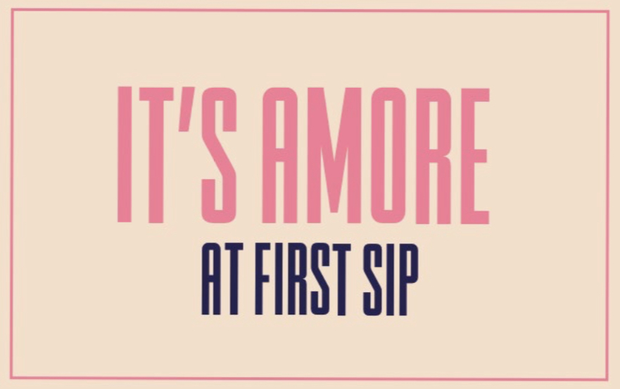
Not only does the visual language stay true to the essence of Italy, but the verbal language too, incorporates Italian phrases in a fun and comical way.
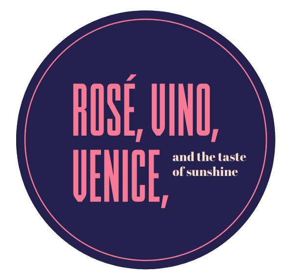
Besides family, fun and vivacious energy, we didn’t want to leave out the sunshine, the sea and the assortment of food and wine that everyone thinks of when they dream of Italy. Although it wasn’t our main focus, you’ll find hints of all these things in our various designs.
Amalfi coast and colours from the beach umbrellas