MAD OVER DONUTS – BRAND BUILDING & PACKAGING

Research & Strategy:

As we set out to study India’s sweet scape, the client’s business objective was threefold:

1. Find and tap newer consumer segments

2. Drive in-store sales

3. Communicate their wide product range

The first step was setting up camp across different MOD store formats, observing and outlining consumer decisions. The second, surveying donut lovers, which revealed a shift in sentiment: donuts were no longer a novelty, but a daily delight.

Research revealed a new audience— 21 to 28-year-old young adults, who had the ability to spend, or order in, and had the autonomy of decision making. Though they became our prime audience, we needed a strategy that wouldn’t alienate our loyalists: kids, college students and corporate individuals. 

Armed with our new discoveries, we wanted MOD to be known for casual treats, stay true to its category and take on the more playful archetype of ‘Jester’.

To speak to this new consumer, we repositioned Mad Over Donuts from ‘affordable indulgence’ to an ‘everyday treat’ and arrived at the brand idea of amplifying everyday or no-occasion celebrations.

Brand Building:

A new positioning in place, our first step was to structure the brand into 3 pillars:

Freshness. Flavour. ⁣Fun.

These three core principles would come to guide the entire brand experience across all touchpoints. From store design to in-store display, the ordering and delivery experience to packaging and gifting, every aspect of the customer journey was re-moulded on one of or all three of these pillars.


Verbal Language:

When developing a new verbal language, we looked to MOD’s audience and offering and decided on a voice that is fun, playful, witty, and conversational. We took the core idea of amplifying happiness and celebrating the everyday across communication, especially while renaming their menu and creating their packaging. Each flavour got a fun story of its own, the menu was segmented into “Donuts” and “Not A Donut” and the in-store communication became far more conversational.

As the most consumer-facing touchpoint, their boxes now stood for the occasions they were bought for—⁣the Triple Treat Box (3), the Perfect Party Box (6) and the Super Celebration Box (12).

Design:

The New Shape Of Happiness

With drawings of donuts covering every inch of the office and plenty of taste tests later, ⁣we finally drew up a mark that stemmed from our 3 pillars and represented the new brand. ⁣

Our research showed us that Mad Over Donuts was mostly referred to as ‘MOD’ so we chose to spotlight the abbreviation in our logo as opposed to the full name.

– To signify fun, we retained their signature orange and brown but gave it new life by switching the tones to their brighter, more energetic avatars.

– For flavour, we cued the hero product, donut and played with the ‘O’.

– And for freshness, the imperfect ring signified the brand’s key offering: fresh, handmade treats.⁣


Visual Language:

The brand’s previous language was complex- evoking softness, love and indulgence.

For the all-new MOD, we grew the brand’s visual assets to be fun, fresh and have universal appeal so as to not alienate our loyalists.

The new palette is dominated by orange, our strongest visual asset with immense recall value, and includes purple as its secondary colour, with tertiary hues being yellow, teal and soft pink- that cue both confectionary and vibrancy when paired with orange or each other.


For the typeface, we chose a universal one that MOD could own- Quicksand being our final choice. We found that its soft edges and round corners, yet clean and bold features offered us enhanced visibility across offline touchpoints like facades and menu screens.


Illustration also became a big part of the brand’s new direction and we created two distinct styles- one to be used for flavours and toppings and the other to communicate the brand’s story and packaging concepts. 


Thinking outside and inside the donut box:

Packaging is MOD’s biggest consumer touchpoint and the main problem was the format of the boxes. Most MOD donuts are heavily topped and often, the top of the boxes touch the donuts, therefore ruining the donuts and the customer experience. To tackle this challenge, we created collapsible handles for every box, so delivery executives would know how to handle it and keep the donuts intact. 

For the packaging design, we used our flavour illustrations on our hero boxes of 3, 6 and 12, intending to change the flavour every month so consumers begin associating MOD with those beyond chocolate. Each flavour design came with a flavour story in the corner, and a fun line of copy to delight consumers. We also introduced the “box of 1” based on the insight of personal and corporate consumption and separate hot & cold takeaway beverage cups. 


A Truly 2020 Launch :

With the onset of the pandemic, we knew it would be some time till donut lovers could come see their new MOD—so we decided to take it to them! MOD’s audience online is young, fun and always on-trend and when we planned a digital launch of the rebrand (the first of its kind), we played to the platforms’ strengths. 

We built up the excitement for a few days before throwing a launch party with the new key message of “Biting into happiness”. It kicked off with a catchy launch video showing the audience MOD’s new energy, look and feel while making sure to communicate that their old favourites weren’t going anywhere. We created a Green Screen background of a virtual MOD store that customers could post on their stories to line up and celebrate, as well as a 15 post grid that mimicked what a new store would feel like- including the new facade, the most loved products and finally the counter with a warm illustration of the staff introducing a celebratory offer. 

To add to the festivities we created custom MOD GIFS (that you can find if you type ‘mad over donuts’ into Instagram’s GIPHY bar), and a “Bite into Happiness” post-launch digital campaign to drive home the key message of everyday celebration.

The opportunity to re-brand one of the country’s biggest brands was phenomenal, but it was the joy of designing happiness that makes what we do, what we love. 


NIVEA MILK DELIGHTS – DESIGNING THE PACKAGING

Background:

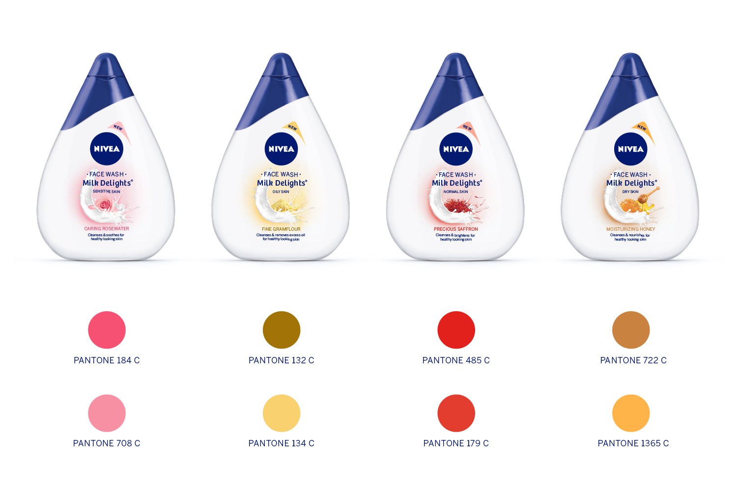
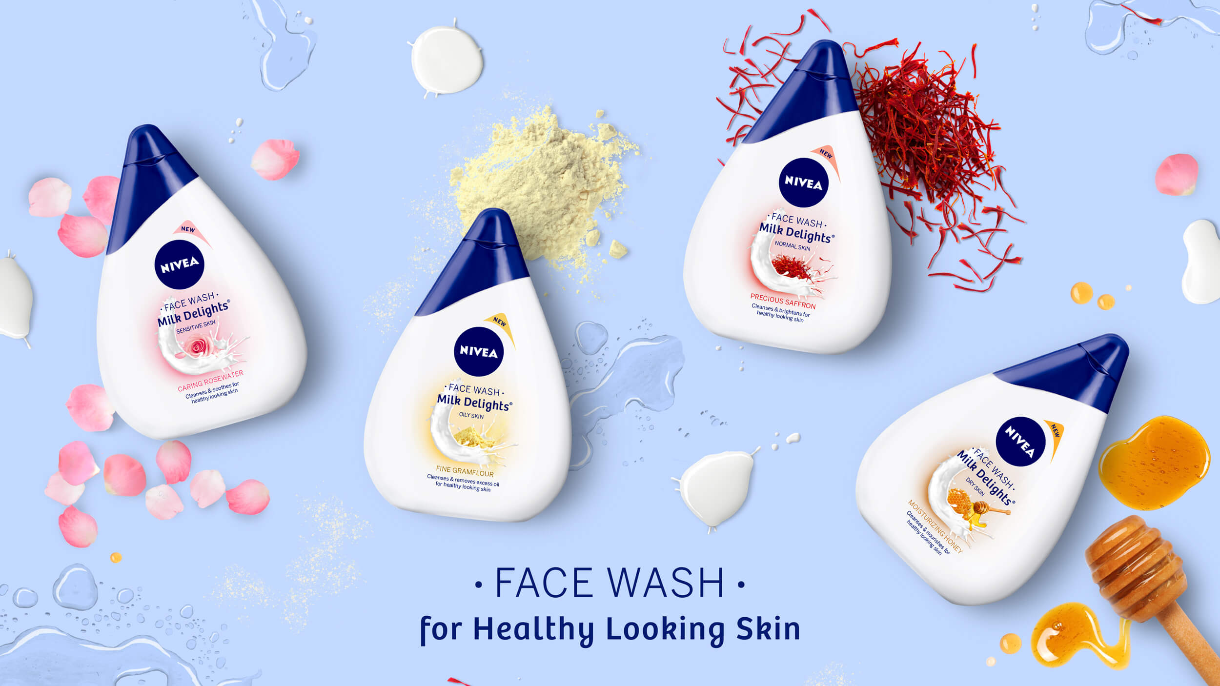
Nivea, commonly known for their extensive product line of creams, lotions, body washes and moisturisers, was in the process of introducing a brand-new product to the Indian market. This new product was a milk-based face wash; something the brand had never brought to India before. While most face wash bottles used the conventional tube-like shape, Nivea experimented further and designed the bottle to look like a drop of milk.

Our task was to design the bottles, while ensuring all the relevant information stood out and consumers understood the use of the products.

Research:

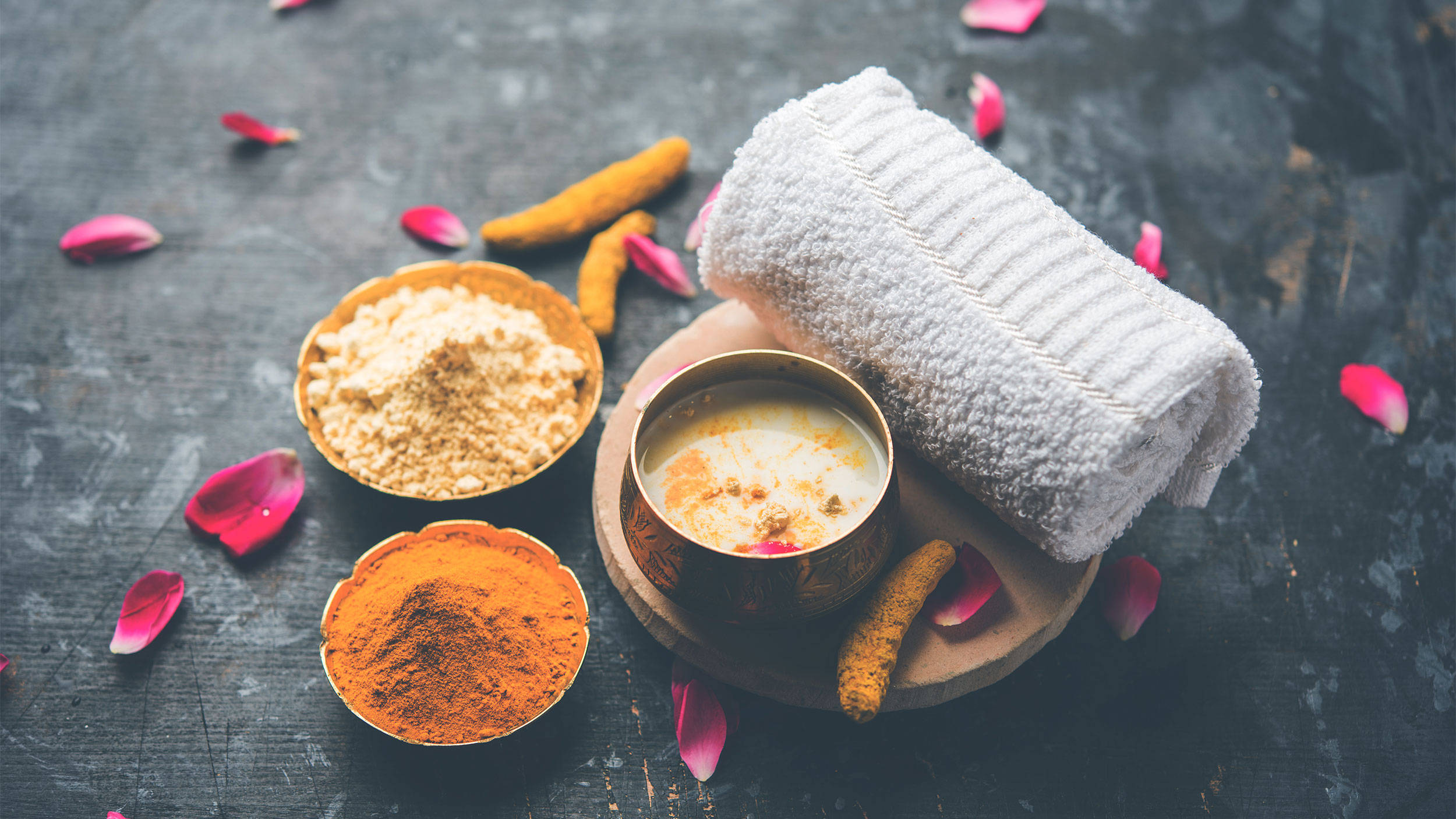
Nivea, through extensive research had noticed that young women in India preferred to use home remedies and known ingredients for all their beauty needs. However, while they had the knowledge and proclivity, what they lacked was the time – to source ingredients, develop recipes and finally apply the product.

When we dug deeper into the consumer, we noticed that Indian women aged 18-30 had specific skin care routines. While these regimens varied from one consumer to the next, each was firmly based on the user’s skin type. We noticed a stark difference between ingredients used depending on whether the consumer had dry skin, oily skin, sensitive skin and so on. This was an important element almost unique to the Indian consumer and had to be taken into consideration when designing the final product. 

Design:

We dove into the design process by looking at the shape of the bottle and developing an information hierarchy that clearly conveyed the usage of each product.

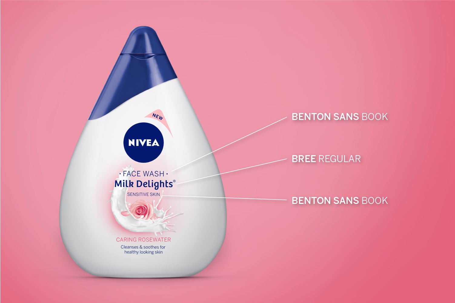
As this was the first time Nivea was launching a milk-based facewash in India, we created distinct typefaces for ‘FACEWASH’ and ‘MILK DELIGHTS’ and placed them clearly and boldly on the label. As part of our communication, we had to ensure that the skin type the product suited was also clearly visible and the resulting effect of the product stood out.

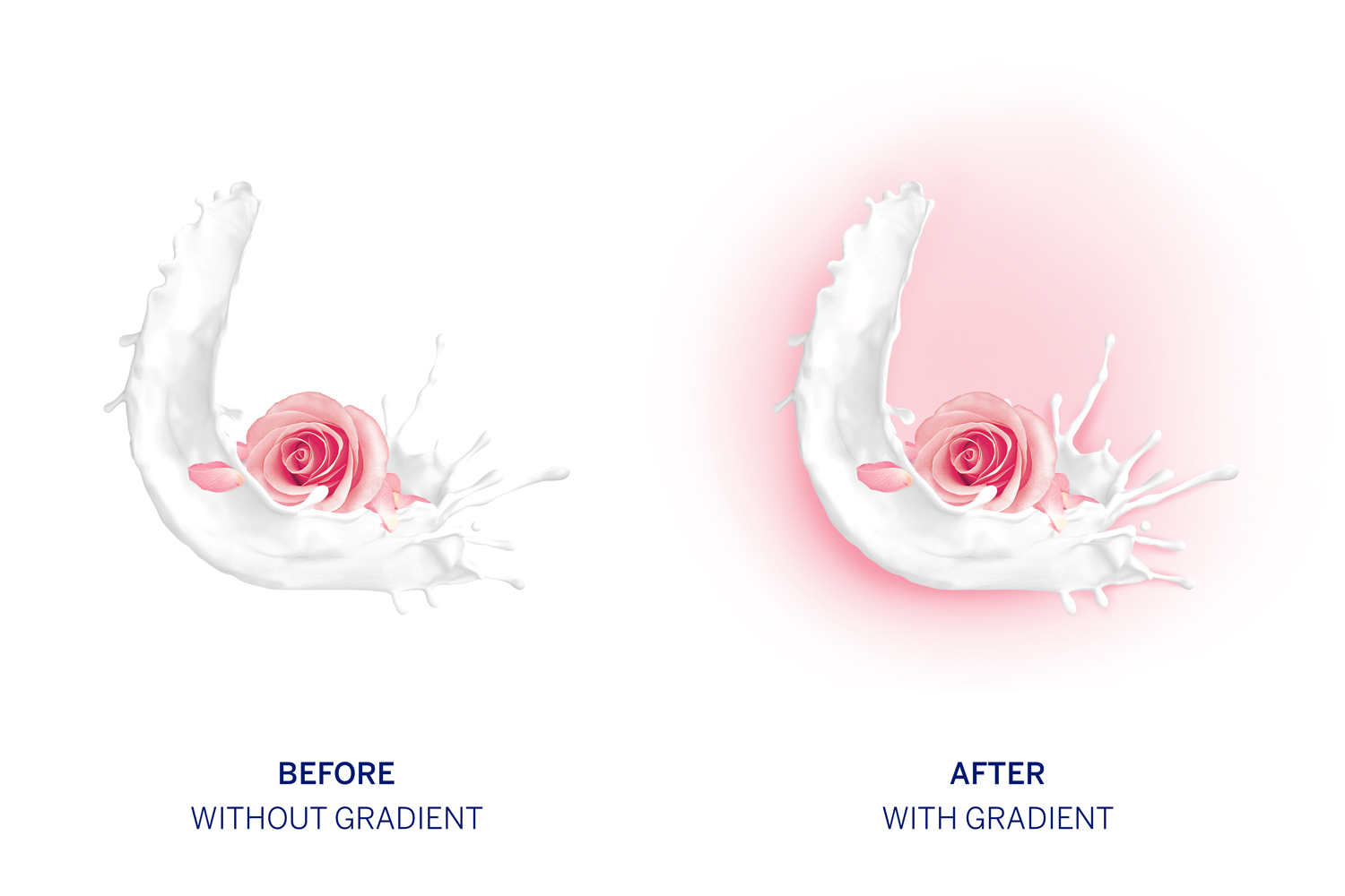
The white colour and shape of the bottle was also something we leveraged through our designs. By adding gradients and splashes of colour, we successfully highlighted the ingredients used in the product as well as brought out the fluidity and viscosity of the milk – the core element in the product.

We now wanted to bring out Nivea’s core positioning which is that every product cares for the consumer and to shine the spotlight on home remedies. To bring these thoughts together, we used the splash of milk as a cradle for the core ingredient, just as a mother cares for her child, and Nivea cares for you.

Our final challenge was to play with the colour of each product’s bottle cap. After exploring multiple options based on the ingredients, we chose to stay true to Nivea’s brand language and go back to the traditional blue caps that are symbolic with Nivea’s products worldwide.

Today, Nivea Milk Delights, with our clean, bold and evocative designs have flooded brick and mortar stores as well as e-commerce platforms across India.

FOODHALL – BUILDING THE LANGUAGE OF FOOD

Problem

Over eight years, Foodhall had established itself as THE luxury food retail destination in Mumbai, Delhi and Bangalore. However, competition grew strife and new players in the market challenged the standard set by Foodhall, the brand that spawned the competition. We had to think of a way to help Foodhall raise the bar for premium retail with new strategy and reclaim its position once again.

Problem:

Over eight years, Foodhall had established itself as THE luxury food retail destination in Mumbai, Delhi and Bangalore. However, competition grew strife and new players in the market challenged the standard set by Foodhall, the brand that spawned the competition. We had to think of a way to help Foodhall raise the bar for premium retail with new strategy and reclaim its position once again. 

Solution:

Our goal was to build a consistent and elevated visual and verbal language for brand Foodhall to enhance the overall shopping experience. 

How it began:

Foodhall was set up with a vision to make food retail a premium experience. They broke away from the food supermarket mould to build a luxury superstore that prioritised curation of both inventory and experiences to offer a holistic food experience. 

When Foodhall approached us, they were an established brand with a predetermined voice and vision for food retail. Their expectation of us was to elevate the brand experience in a way that distinguished them from the growing competition and to create systems that were easily replicable across Foodhall’s brands and services.

Research and analysis:

Our research started with shadowing Foodhall’s target audience – the expats, the well-travelled male and female in their 40s and the homemakers in their 60s looking for upgrades in their lifestyle through food. 

It’s a customer that understood food and loved food, so we had to create a language and experience that inspired them to cook better, plate better and eat better. We had to talk to and educate this niche audience in a manner that is well-informed but not preachy. And since we were communicating with a more mature audience, the language had to be simple and straightforward yet evocative.

Defining the problem:

The more we immersed ourselves into the world of Foodhall the more we noticed the need for consistency across their stores. Our execution had to be relevant for Foodhall pan-India. 

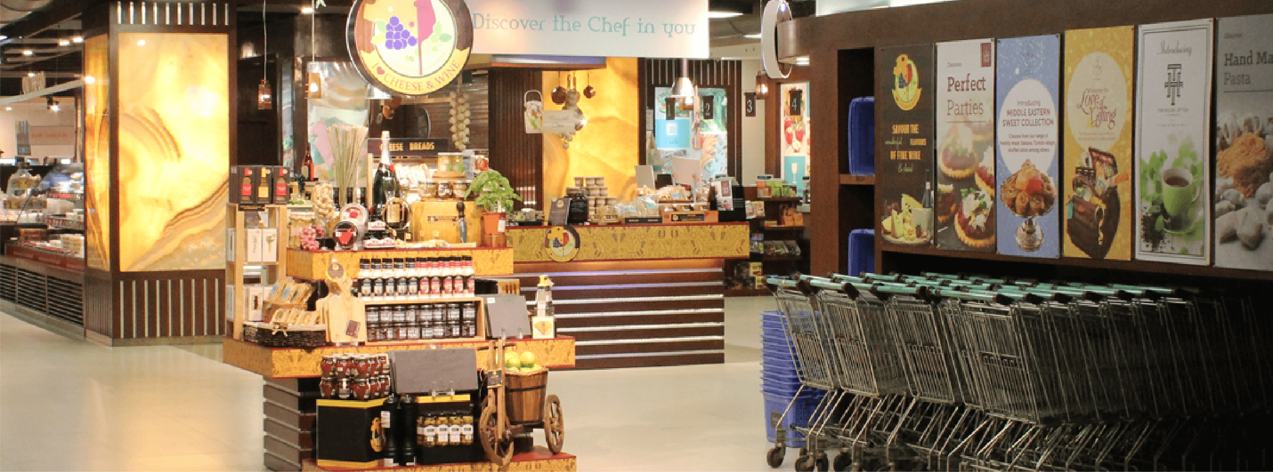
We also noticed that a lot of communication was lacking at the store level. There was a lot on offer across the aisles and sections, however, there was no binding story and very few touchpoints that were prompting consumer interaction. 

Building the design and brand language:

To tackle this mammoth brand, we created systems and adopted a step-by-step approach to the revamp. To build up Foodhall as a whole, we had to first elevate its parts. Our task, as we saw it, was to 

1.Build the brand

2.Create an expression for the brand

3.Work on extensions of the brand

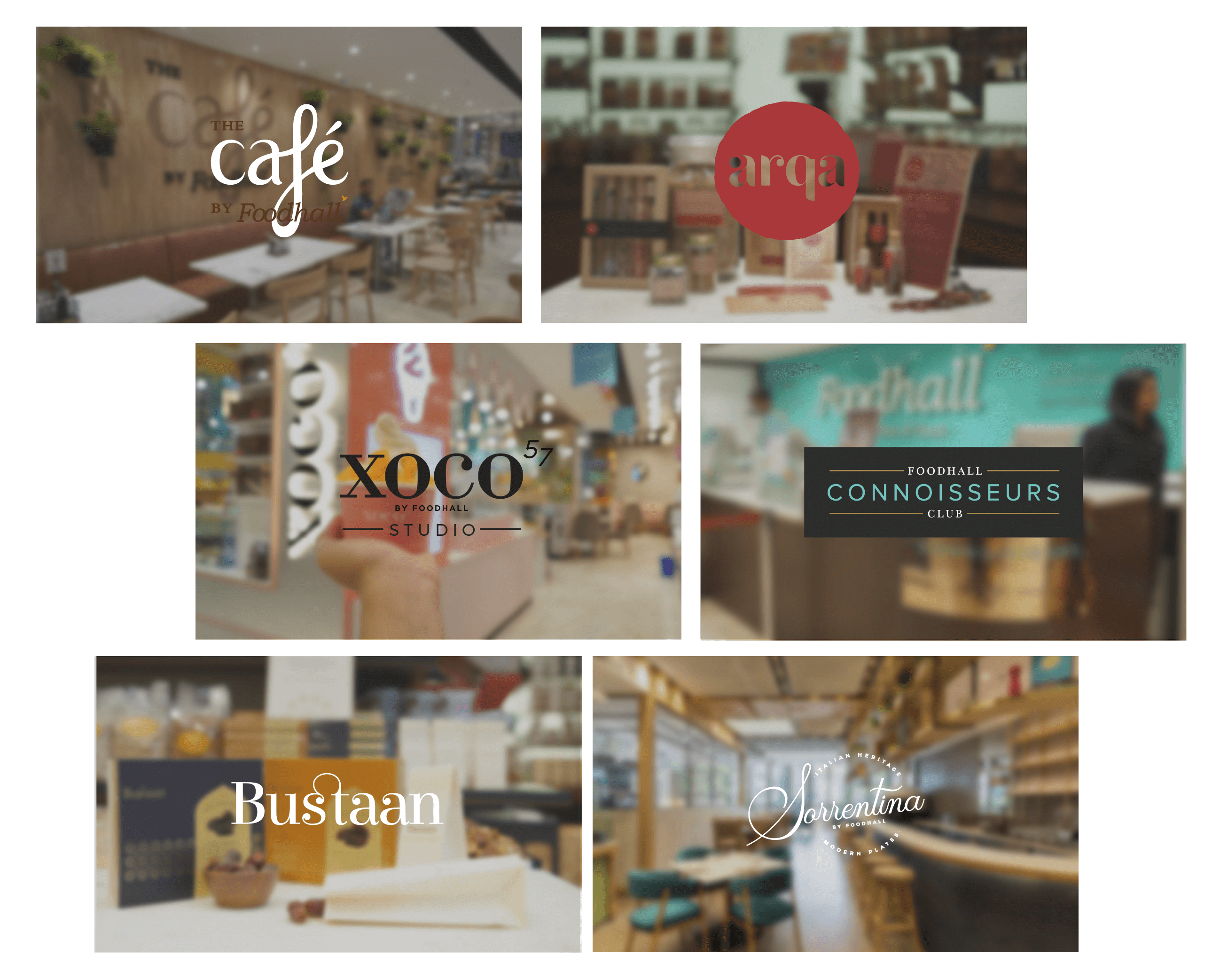
4.Create identities and a language for the brands and services by Foodhall

Nothing communicates the love of food more than the vocabulary of food. Our first step was to craft a folklore for the brand that conveyed Foodhall’s values and the quality of its offerings. The next step was to update their pledge that reiterates Foodhall’s promise of curating the finest ingredients and experiences for its food forward customers. 

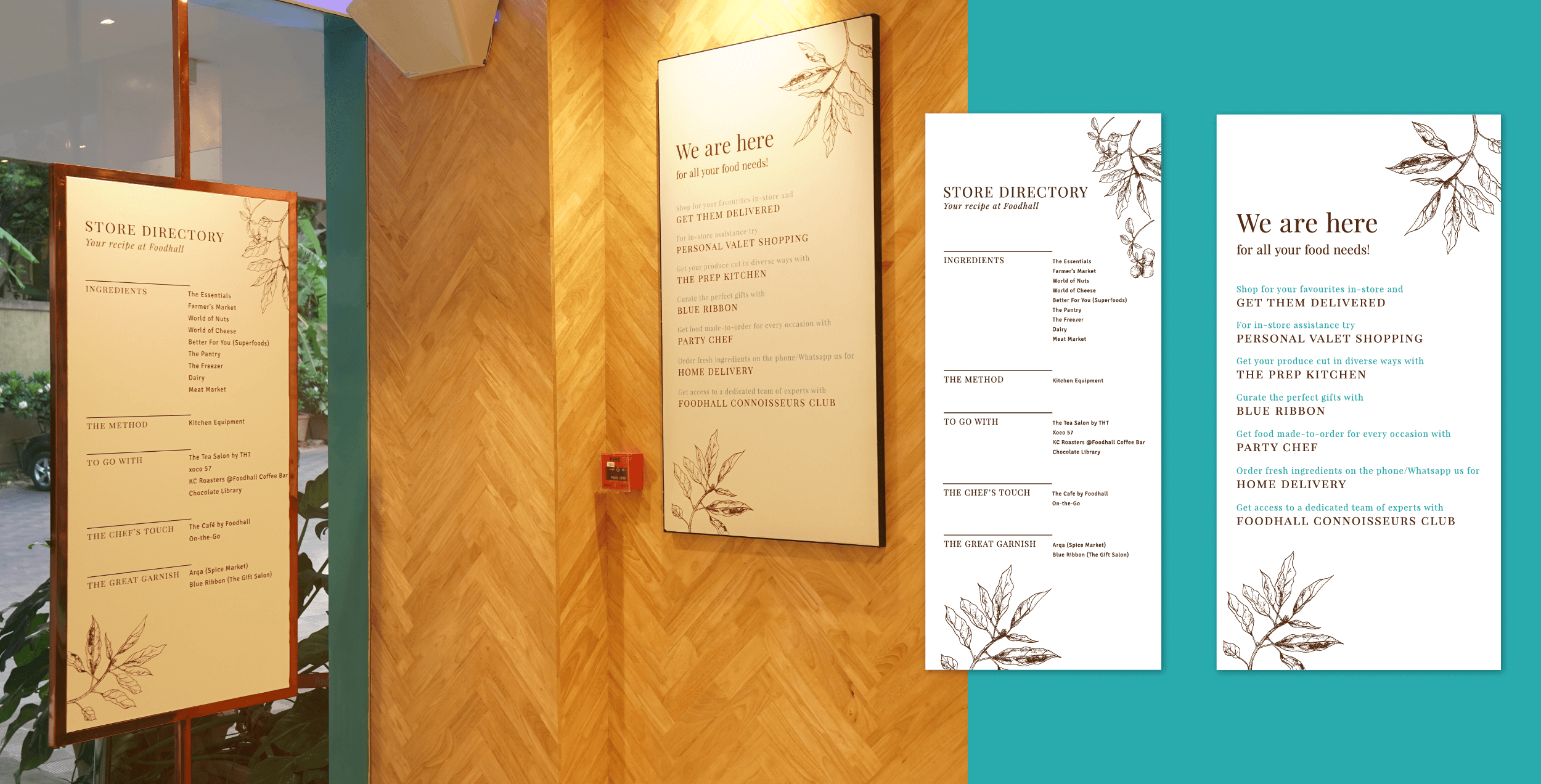
We extended this vocabulary to the store directory, which we fashioned after a recipe. We broke up the sections in the store in the way a recipe is broken down, thus making an immediate connection with the act of buying ingredients and the act of cooking. 

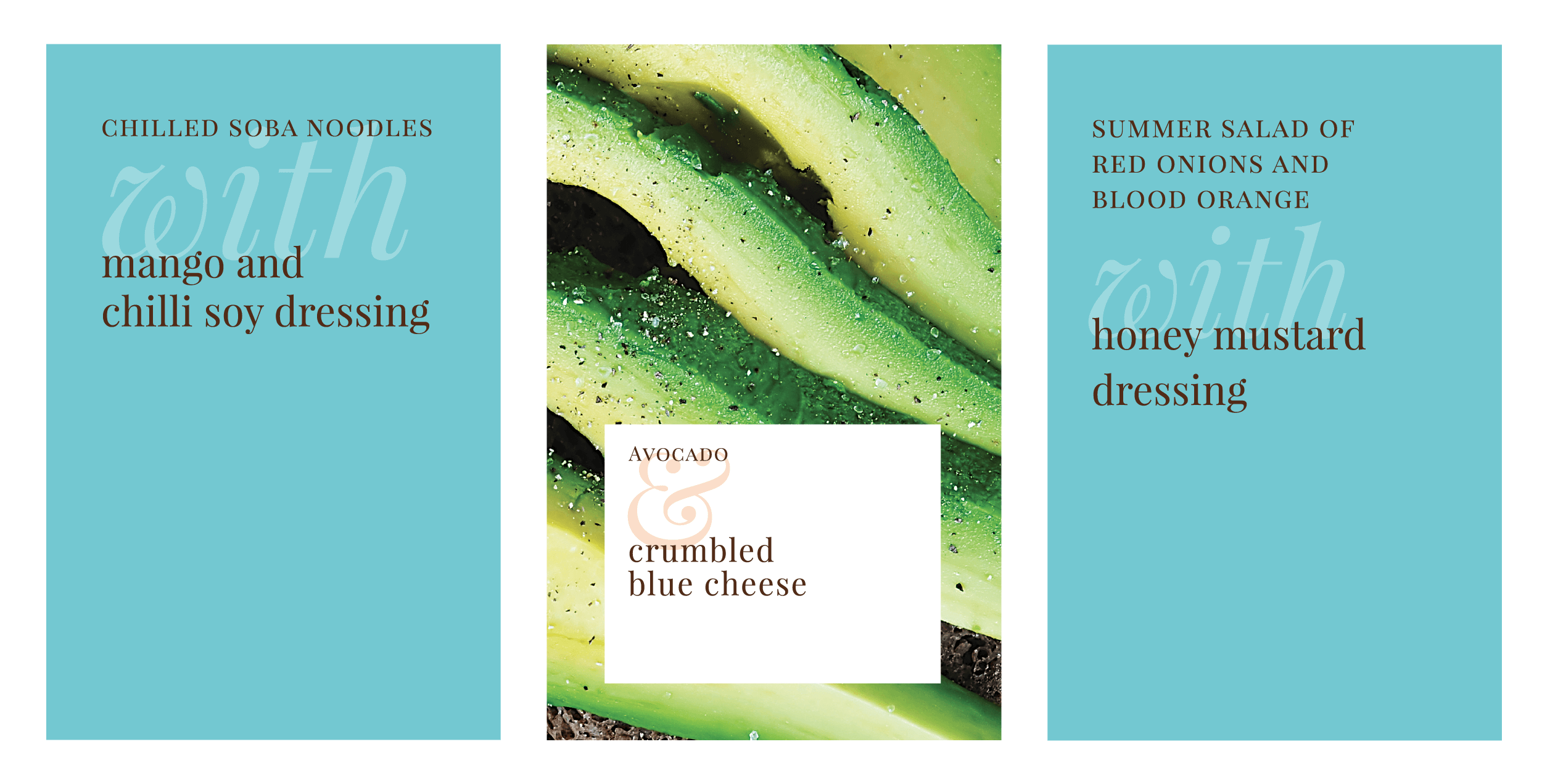
We simultaneously worked on a visual vocabulary capitalising on the vibrant colours of food for brand posters. To convey the range of ingredients and the possibilities they present in the kitchen, we created pairing posters dominated by vivid photographs of stunning dishes. By highlighting two distinct ingredients used to make the dish and designing a stylised ampersand, we conveyed not just the type of ingredients we offered, but what people could create with them. The posters were installed in and outside the store and spoke loudly of Foodhall’s USP without over-communicating. 

Strategy: 

Once the visual and verbal styles were set, our focus was to delve deeper into the consumer journey. To this end, we created a system of templates to announce new products and services in the store, educate customers about the uses of niche items, and encourage sampling within the store to boost sales.

While setting up these systems, we set aside blue and brown as the primary colours for brand communication and created a different palate for all secondary communication, thus achieving more clarity in the store. 

Foodhall’s commitment to food extends beyond curation, and includes services that make cooking more convenient and engaging. We invested a lot of time in highlighting these services that are key in setting Foodhall apart from its competitors. 

Setting up the flagship store:

In December 2018, we launched Foodhall’s newest store that was set to redefine food retail in India. Spread out over 25,000 square feet and rising four floors high, Foodhall@Linking Road consisted of it’s own café, restaurant, coffee lab and cookery studio, not to mention over 8,500 high-quality ingredients.

The replicable systems we had set up, and the brand language we had developed allowed us to lay emphasis on everything from the overall store design and in-store experiences to looking at business opportunities for individual product categories and Foodhall brands.

Today, Foodhall has recorded its highest sales since its inception, with in-store revenues increasing by 20-30% and Café sales growing by 30%.