Falcon’s cutting-edge technology enables companies to go to market with their fintech products in as little as a day. They are creating the future of money.
To establish themselves, Falcon approached us to create a brand identity and website as powerful as their platform, that speaks to both traditional and new-age businesses.
How did we help them with that?
As Falcon deals with money, the identity had to cue trust and expertise, while at the same time, being contemporary and bold. To achieve this we tapped into the mindset of growth often found with new businesses.
Positioning
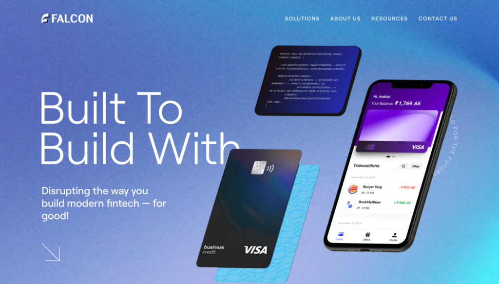
We locked in “Built To Build With” as our tagline, which symbolised collaboration and expertise but also established Falcon as the building blocks for their clients to build upon.
The Design & Brand Language
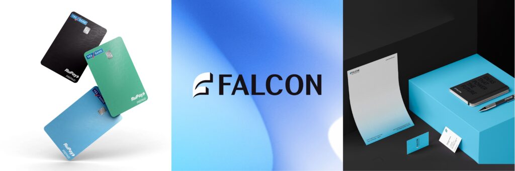
The “F” shaped logo was inspired by the form of the falcon bird with emphasis on its beak.
Falcon Favicons: Our favicon is a simplified version of our logo. It appears as a thumbnail in browsers next to the Falcon website address. We use it as a substitute for the logo when we want to have more fun with the mnemonic.
Shades of blue, white and black were selected to bring in trust and expertise while maintaining a confident personality. A fluid mesh gradient cued the dynamism of the brand and plays a vital role across communication.
The iconography and illustration style are a combination of 3D and geometric shapes. By layering colours and shapes we brought in the idea of Falcon’s highly customisable stack.
Innovation Meets Website
With Falcon set to disrupt the industry, our challenge was to create a website that is equally innovative and future-forward. As the website is the brand’s primary digital touchpoint, this could only come to life using the latest technology, WebFlow.
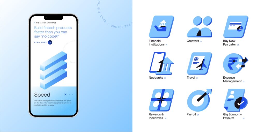
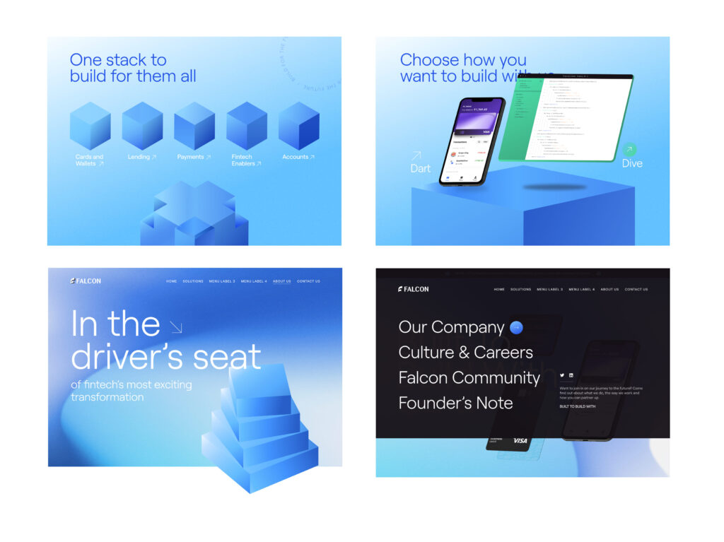
Expanding on our tagline, “Built To Build With”, we created isometric blocks to represent our core offering and convey key USPs. With a wide range of offerings comes an equally extensive set of icons made with geometrical shapes and sharp corners.
Building Interaction
Heroing the movement and interaction played an important role to build intrigue. The visual assets transformed as one navigated through the website, reflecting key information with every scroll. We then added a layer of micro-interactions and animations to make the experience more engaging.
This resulted in a responsive website that was disruptive for an audience eager to take on the future of fintech.
MAD OVER DONUTS// Brand & Packaging Design
Project Year
2021
Client
Mad Over Donuts
Project Type
Rebrand
Location
India
Research & Strategy
As we set out to study India’s sweet scape, the client’s business objective was threefold:
Find and tap newer consumer segments
Drive in-store sales
Communicate their wide product range
The first step in our research was setting up camp across different MOD store formats, observing and outlining consumer decisions while simultaneously staking out other stores in the same category. The second, surveying tons of donut lovers which revealed a shift in sentiment: donuts were no longer a novelty, but a daily delight and consumers had moved on from chocolate to include more sophisticated flavours.
Research revealed a new audience— 21 to 28-year-old young adults, who we realised had the most ability to spend, ordered in a ji nd ate out the most, had the autonomy of decision making and could also be targeted for multiple occasions. Though they became our prime audience, we needed a strategy that wouldn’t alienate our loyalists: kids, college students and corporate individuals.
Armed with our new discoveries, we wanted MOD to be known for casual treats, stay true to its category and take on the more playful archetype of ‘Jester’—with most dessert brands already crowding the ‘Lover’ archetype and few occupying this space.
To speak to this new consumer (who actively seeks joy in the everyday or indulges in daily delights) we homed in on a strategy that hit the sweet spot. We repositioned Mad Over Donuts from ‘affordable indulgence’ to an ‘everyday treat’ and arrived at the brand idea of amplifying everyday or no-occasion celebrations.
Brand Building
A new positioning in place, our first step was to structure the brand into 3 pillars:
Freshness. Flavour. Fun.
These three core principles would come to guide the entire brand experience across all touchpoints. From store design to in-store display, the ordering and delivery experience to packaging and gifting, every aspect of the customer journey was re-moulded on one of or all three of these pillars.
Verbal Language
When developing a new verbal language, we looked to MOD’s audience and offering and decided on a voice that is fun, playful, witty, and conversational. We took the core idea of amplifying happiness and celebrating the everyday across communication, especially while renaming their menu and creating their packaging. Each flavour got a fun story of its own, the menu was segmented into “Donuts” and “Not A Donut” and the in-store communication became far more conversational.
As the most consumer-facing touchpoint, their boxes now stood for the occasions they were bought for—the Triple Treat Box (3), the Perfect Party Box (6) and the Super Celebration Box (12).
Design
The New Shape Of Happiness
With drawings of donuts covering every inch of the office and plenty of taste tests later, we finally drew up a mark that stemmed from our 3 pillars and represented the new brand.
Our research showed us that Mad Over Donuts was mostly referred to as ‘MOD’ so we chose to spotlight the abbreviation in our logo as opposed to the full name.
To signify fun, we retained their signature orange and brown but gave it new life by switching the tones to their brighter, more energetic avatars.
For flavour, we cued the hero product, donut and played with the ‘O’.
And for freshness, the imperfect ring signified the brand’s key offering: fresh, handmade treats.
Visual language
The brand’s previous language was complex- evoking softness, love and indulgence.
For the all-new MOD, we grew the brand’s visual assets to be fun, fresh and have universal appeal so as to not alienate our loyalists.
The new palette is dominated by orange, our strongest visual asset with immense recall value, and includes purple as its secondary colour, with tertiary hues being yellow, teal and soft pink- that cue both confectionary and vibrancy when paired with orange or each other.
For the typeface, we chose a universal one that MOD could own- Quicksand being our final choice. We found that its soft edges and round corners, yet clean and bold features offered us enhanced visibility across offline touchpoints like facades and menu screens.
Illustration also became a big part of the brand’s new direction and we created two distinct styles- one to be used for flavours and toppings and the other to communicate the brand’s story and packaging concepts.
Thinking outside and inside the donut box
Packaging is MOD’s biggest consumer touchpoint and the main problem was the format of the boxes. Most MOD donuts are heavily topped and often, the top of the boxes touch the donuts, therefore ruining the donuts and the customer experience. To tackle this challenge, we created collapsible handles for every box, so delivery executives would know how to handle it and keep the donuts intact.
For the packaging design, we used our flavour illustrations on our hero boxes of 3, 6 and 12, intending to change the flavour every month so consumers begin associating MOD with those beyond chocolate. Each flavour design came with a flavour story in the corner, and a fun line of copy to delight consumers. We also introduced the “box of 1” based on the insight of personal and corporate consumption and separate hot & cold takeaway beverage cups.
A Truly 2020 Launch
With the onset of the pandemic, we knew it would be some time till donut lovers could come see their new MOD—so we decided to take it to them! MOD’s audience online is young, fun and always on-trend and when we planned a digital launch of the rebrand (the first of its kind), we played to the platforms’ strengths.
We built up the excitement for a few days before throwing a launch party with the new key message of “Biting into happiness”. It kicked off with a catchy launch video showing the audience MOD’s new energy, look and feel while making sure to communicate that their old favourites weren’t going anywhere. We created a Green Screen background of a virtual MOD store that customers could post on their stories to line up and celebrate, as well as a 15 post grid that mimicked what a new store would feel like- including the new facade, the most loved products and finally the counter with a warm illustration of the staff introducing a celebratory offer.
To add to the festivities we created custom MOD GIFS (that you can find if you type ‘mad over donuts’ into Instagram’s GIPHY bar), and a “Bite into Happiness” post-launch digital campaign to drive home the key message of everyday celebration.
—-
The opportunity to re-brand one of the country’s biggest brands was phenomenal, but it was the joy of designing happiness that makes what we do, what we love.
SHUNYA// Packaging Design
Project year
2021
Client
Mad Over Donuts
Project type
Packaging Design
Location
India
What did the brand need help with?
Shunya is a 0 Calorie, 0 Sugar, 0 Artificial Sweetener drink. Inspite of this drink being the answer to all our health prayers – consumers were not flocking to the stores and grabbing them off the shelves. Shunya needed to communicate great taste and unbelievable good health in a bottle.
How did we get our hands dirty?
Part of what we did to launch Shunya, was to get on the streets and get consumers to try the drink. We designed a Shunya Jeep – hopped on and drove all over the city to get the drink in consumers hands.
From burger joints in Delhi to corporate football matches in Bangalore to Joggers park and Lower Parel in Mumbai – we spoke to consumers and understood what they loved.
– A hydrating drink for health and sport – A fizzy drink for fun and indulgence
Where did we sow the seeds of smart design?
Branding the hydration drink Shunya Go – alluding to an active lifestyle, a trend we see growing at an increasing rate. This also created a need for the product in consumer’s everyday.
We changed the bottle to make it smaller and more on the go. And the design brought up more of the ingredients, as active health cues.
The carbonated drink was branded Fizz – to cue in fun and excitement. With Fizz, we played with gradients and neon to amp up the desire and attractiveness – we also created a dream like feeling on the can, to bring out the unbelievable-ness of the drink.
The typography took us to a retro cool space, to be more trendy with todays aesthetic.
Has the brand moved any mountains?
Over the last 9 months we helped establish the brand with the previous packaging. We took this time to learn the market, support the client in building their team and distribution network.
With our new packaging, new distribution model, digital marketing, new brand language and GTM strategy in place, we are now poised to get these products in everyones homes.
What were the things we did for love?
We never gave up – when consumers didnt believe whats in the can or bottle, we convinced them by redesigning it. When they didnt love the after taste, we supported the client while they enhanced the flavours. When they didnt know when to drink it – we set up occasions to do so.
We helped design health to look cool.
PARLE ROLA COLA// Digital Campaign
Project year
2021
Client
Mad Over Donuts
Project type
Packaging Design
Location
India
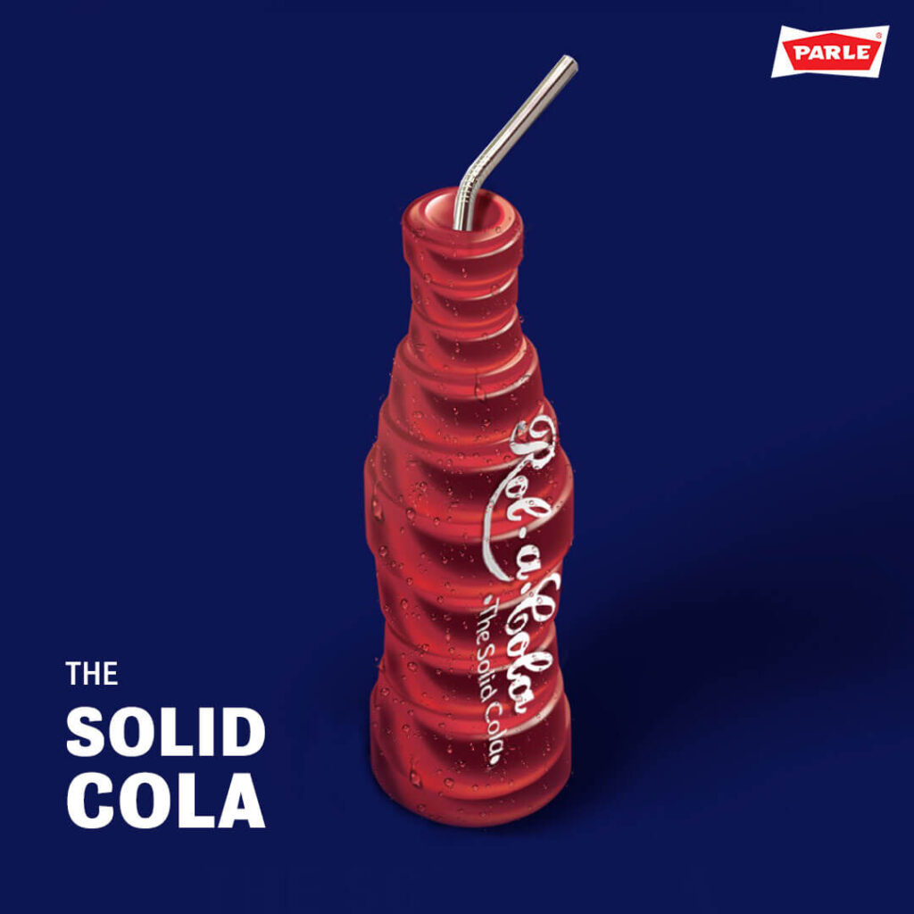
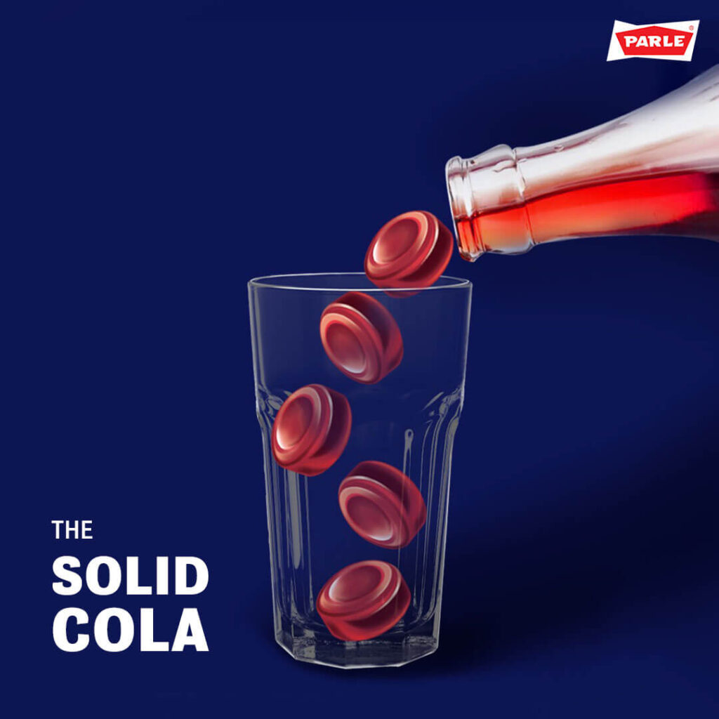
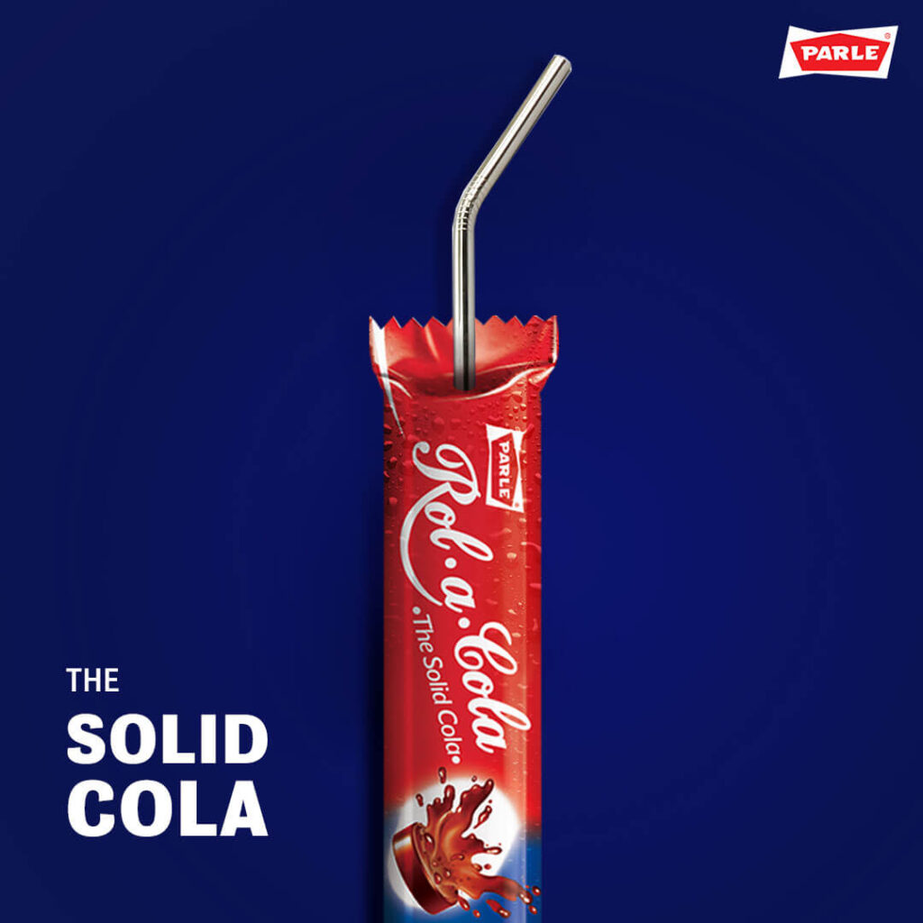
How do you rekindle the love of a nation for a simple cola flavoured candy?
WHAT DID THE BRAND NEED HELP WITH?
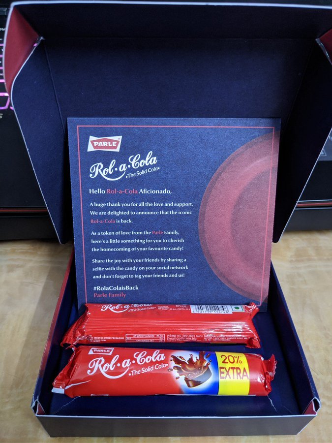
Parle’s Rola Cola was a much loved candy from our childhood that was no longer in circulation. On Twitter, a loyal fan asked us what he would need to do for the brand to bring the candy back into circulation.
We set out an attainable task. If he garnered enough love for the candy online, we’d get Parle to re-launch Rola Cola.
WHERE DID WE SOW THE SEEDS OF SMART DESIGN?
We asked our loyal fan to gather 10,000 re-tweets in order to bring back the candy. The number was carefully selected, as it was attainable, but yet slightly out of reach. It would take a few months to reach this digital milestone (re-Tweets) and in that time Parle could get production started.
Most of all, consumers now felt they had a say in this candy being available – they had a sense of ownership in the process of reviving it.
HOW DID WE GET OUR HANDS DIRTY?
It was not about reaching the number, but about the journey. We pushed consumers along, enticing them to keep the excitement alive. The feeling of almost reaching that number.
Our campaign was focused on showing consumers how close they were to making it happen – bringing back their beloved candy! Their hard work was paying off.
HAS THE BRAND MOVED ANY MOUNTAINS?
The product is out in the market, it’s selling very well, and consumers feel like it’s their own candy. The transition from nostalgia to a new (updated) Rola Cola has allowed us to be relevant to the newer, younger consumers as well.
WHAT WERE THE THINGS WE DID FOR LOVE?
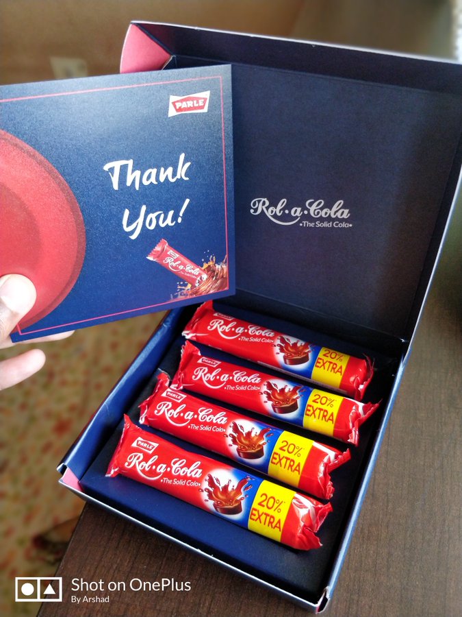
This campaign was built on love. The love for this candy, and the love for our childhood. For quite a few fans that showed us love online, Parle sent them a Rola Cola care package as a thank you.
The person who tweeted first was the first to get his hand on the updated Rola Cola.
Mumum – Changing the way kids snack, with design that speaks their language
Changing the way kids snack, with design that speaks their language
Problem to solve:
As most mothers will tell you, getting a kid to eat their meals is one of their greatest struggles. Our job was to find a way to get our brand to entice the kids into eating these healthy snacks while also assuring the mothers that it was good for their children.
Solution:
Creating a brand that speaks to both mothers and children in a language that they can both relate to, and find relevant.
How it started:
Mumum was started by two mothers who wanted a healthier option for their kids to snack on. When they realised that they weren’t alone in their predicament, they decided to create an all-natural, good-for-kids snack.
When they approached us with their vision of creating an honest brand that could enable better eating habits and snacking for children, we jumped at the chance to create a brand that would set the tone for this almost non-existent category of food in the Indian market.
Research & Analysis:
Our first port-of-call was mothers — we wanted to know what snacks their
kids ate, how they picked snacks for their kids, when they ate these
snacks, and everything else in between — basically study usage, attitude
and purchase.
Young kids have sensitive taste buds; so typical packaged snacks, especially sweet ones offer an explosion of taste that they love. These snacks are also easily accessible and much advertised increasing desirability.
When we asked them what their kids ate between meals, these were the answers we got:
Kurmura, Lays, Mad Angles, Dahi, Chocolate.
None of these choices were healthy, not to mention, that almost none of the snacks were actually meant for kids! And while feeding the child was a big concern for mothers, but the mother didn’t have too many options for what she could feed her child. For ideas of the food, she depended on the tried and tested food items that the elders in the family and the mother’s friends knew of.
From our Shelf and Market Landscape research, we found that the international market approach to branding similar products focused on talking to mothers about the health benefits of the products. While back home in India, we realised that although there were some newer players entering the market for kids’ snacks, the focus on health was missing; and the few healthy products that did focus on health, did so far too seriously to be considered a kids’ snack in the mother’s mind. What we found more interesting, was that while the healthy snacks aisle was beginning to take shape, there was no sign of an aisle or a shelf for kids’ snacks anywhere on the horizon.
The Seed Idea
All the
primary research with mothers and kids and extensive discussions with
the founders, helped us finally distill the truth of our brand. We
decided to build the brand around the endearing bond that exists between
a mother and her child. This became our seed idea and defined
everything we did for the brand after.
Our clients had a working name for the brand — Mumum, and after our research we felt the name Mumum fit the idea perfectly. It clearly referred to food (by infants and even toddlers), and hinted at the founders in a way. We tweaked the name to make the brand clearer as an entity and to comply with legal requirements, calling it The Mumum Co.
Defining the Problem
Discussions
we had with mothers made it clear that every mother goes to great
lengths, suffers tantrums and performs theatrics to get her child to
eat. And that’s when we wondered — what if our brand could actually make
the child want to eat?
We were now solving two problems with our brand design:
1. Make the child want to eat → Our brand should talk to kids
2. Assure the mother that this is good for the child → Our brand should talk to mothers
We wanted to be an honest but lighthearted brand that encouraged the child and the parent to have fun.
Brand Design:
Once we
convinced our clients that this is what we should do, we moved on to
designing the brand. To kickstart the process, we turned to our
end-consumer — children! After spending our time watching, observing and
playing with them, we knew that if we wanted to make Mumum attractive
for kids, we needed to speak their language, in every way we could.
Because kids don’t see things the way we do, we had to look at things the way kids would.
For our visual language, we explored all the ways in which mothers interact with their kids before we found ourselves gravitating toward doodle drawings. We used a doodle style M of Mumum to create unique representations for our product ingredients and brand attributes. This was a powerful route, as it meant that even if we wanted to represent something like carrots, we could do it in a style we could own so that kids could relate to it and mothers could see exactly what her baby was eating.
After exploring various design routes, we settled on this one which plays up the ‘M’ in different ways—the identity needed to be warm but also exciting. Working logos (left), Final logo for the brand (extreme right)
For the main brand identity we took the M of the logo and turned it into
a heart to emphasise the love between mums and their kids. The M and
the heart, also became the most responsive part of our logo, turning
into characters, animals and ingredients to engage with the imagination
of kids.
Bringing the ingredients to life in our language
Our
verbal language was based on the way kids speak. Literary devices like
repetition, alliteration and language that is colloquial for children in
general, came to define our verbal style. It’s rooted in exaggeration,
creating a world that’s bigger than a child knows. Hence, the tagline
couldn’t be ‘Very Real’; it had to be ‘Very Very Very Real’!
The simple language also made it easier to break down all the ingredients and processes in a lucid and easy-to-understand manner for the mother to read while still retaining the brand’s lighthearted and fun elements.
Packaging Design
From our past experience and our primary research, we found that the
best way to understand a product is through its texture, shape and
taste. And that’s how we came to name the Mumum product lines — Melties, Crunchies, Chewies and Sprinklies. Since
our brand language centred around children, we needed to ensure that
each texture variable name was distinct enough from the other.
A wide product range meant that the colours, patterns and characters all needed to come from one family, while ensuring each pack could stand out by itself.
To this end, we created characters that personified each product line on
the front of the pack. Eg. Melties became and got an Elephant to own
the mightiness! The typography of the product name, and the patterns
were also inspired from the texture of the product.
On Shelf
Since
there was no real category for children’s snacks in most shops, we
needed the product to stand out that much more when stacked on shelf
along with other health food products. When our client expressed their
idea of creating a multi-pack that could also double up as a ready shelf
unit, we designed what we like to call the ‘retail-ready tray’.
With an easy-to-tear-off top, the multipack doubles up as box to keep individual packs in — on the shelf or even on the counter.
The
design of the tray served a dual purpose — a retailer could sell this as
a Multi-pack of 4 bags, but they could just as easily tear off the top
and use it as a tray for individual bags,
The multi-pack later became the main SKU for our online channels. The Pack of 4 made it more practical for consumers to buy online, and also easier for online players to manage efficient delivery.
Happily Ever After?
A strong brand language enabled the brand to stand out across touchpoints — pop-ups, on-shelf, website, etc.
A strong brand language enabled the brand to stand out across touchpoints — pop-ups, on-shelf, website, etc.
We
don’t necessarily believe in fairytales, hence we are always learning,
and striving to do a better job. Which is why we’re still making minor
revisions to our designs, and are in the process of extending the range
to include more products that will appeal to more consumers.
Cin Cin cinquè
The problem
Cin Cin, prounounced Chin Chin, is an Italian restaurant and bar that wanted to give Indians a taste of an authentic Italian experience.
Our direction
Unlike most brands that would use a foreign language to stay a cut above the rest, we decided to incorporate Italian in a more inclusive way, by giving pronunciation cues and even explaining how these phrases are relevant to everyday life in Italy.