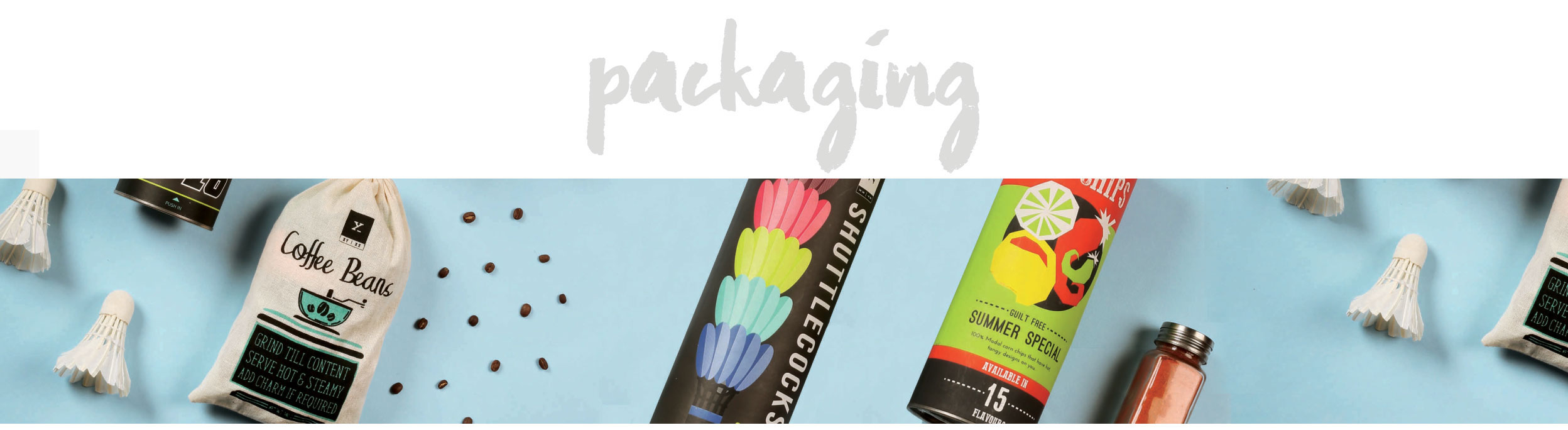
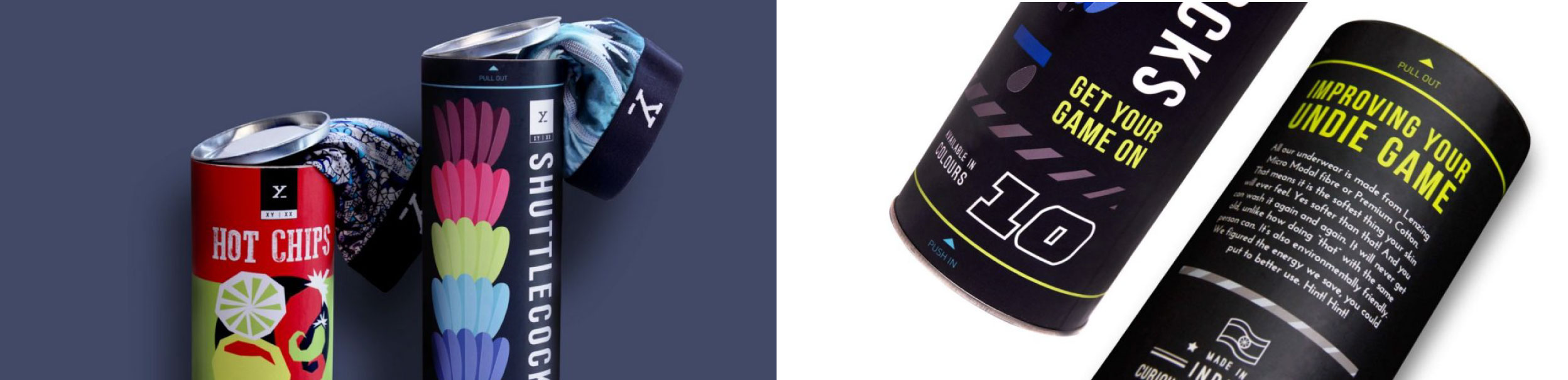
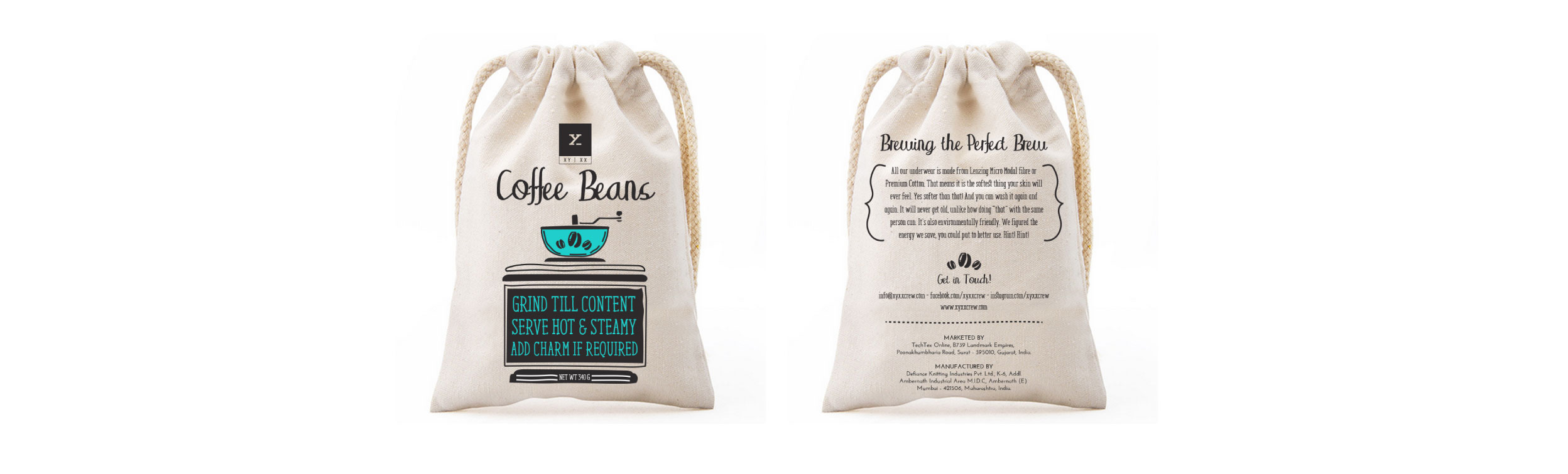
Project Year
2018
Client
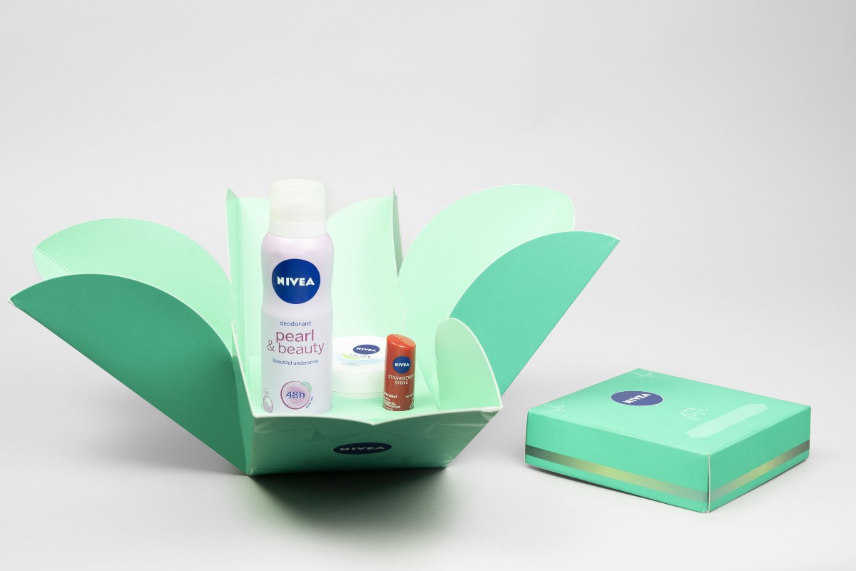
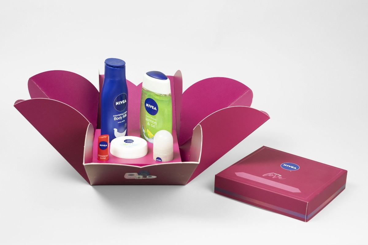
Nivea
Project Type
Fashion & Beauty
Location
Mumbai
The Background
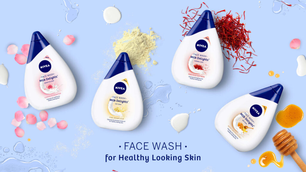
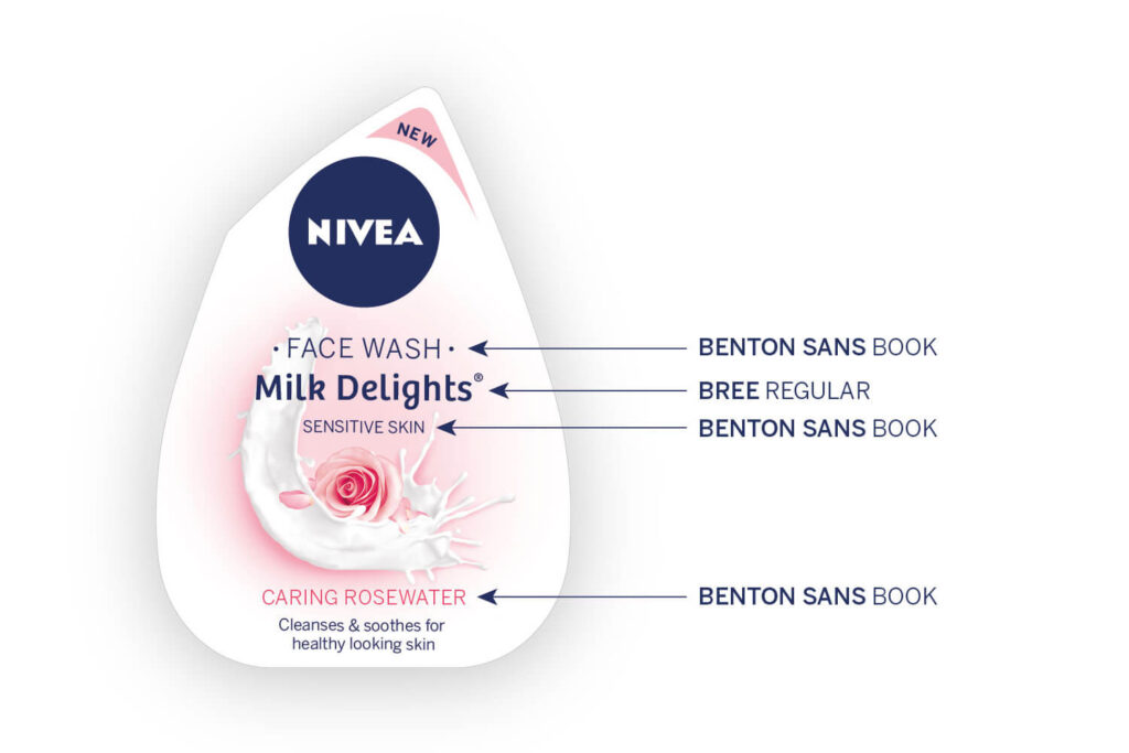
Nivea, commonly known for their extensive product line of creams, lotions, body washes and moisturisers, was in the process of introducing a brand-new product to the Indian market. This new product was a milk-based face wash; something the brand had never brought to India before. While most face wash bottles used the conventional tube-like shape, Nivea experimented further and designed the bottle to look like a drop of milk.
Our task was to design the bottles, while ensuring all the relevant information stood out and consumers understood the use of the products.
The Research
Nivea, through extensive research, had noticed that young women in India preferred to use home remedies and known ingredients for all their beauty needs. However, while they had the knowledge and proclivity, what they lacked was the time – to source ingredients, develop recipes and finally apply the product.
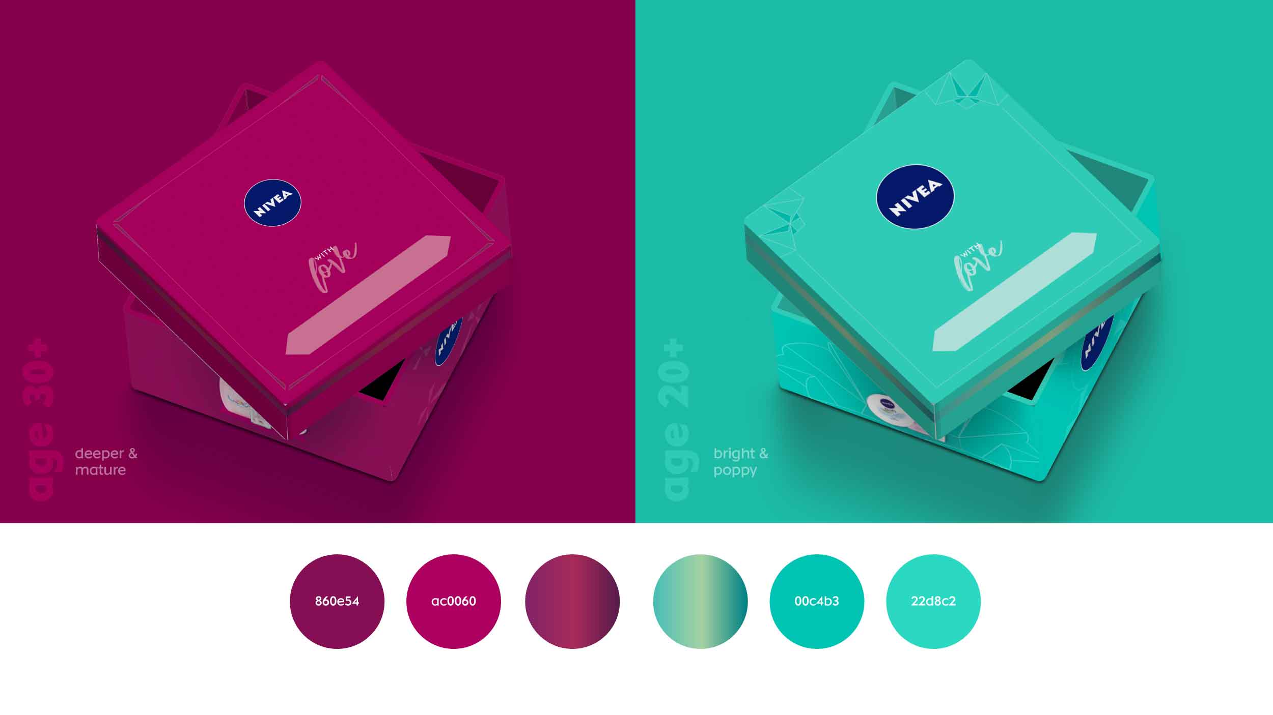
When we dug deeper into the consumer, we noticed that Indian women aged 18-30 had specific skin care routines. While these regimens varied from one consumer to the next, each was firmly based on the user’s skin type. We noticed a stark difference between ingredients used depending on whether the consumer had dry skin, oily skin, sensitive skin and so on. This was an important element almost unique to the Indian consumer and had to be taken into consideration when designing the final product.
The Design
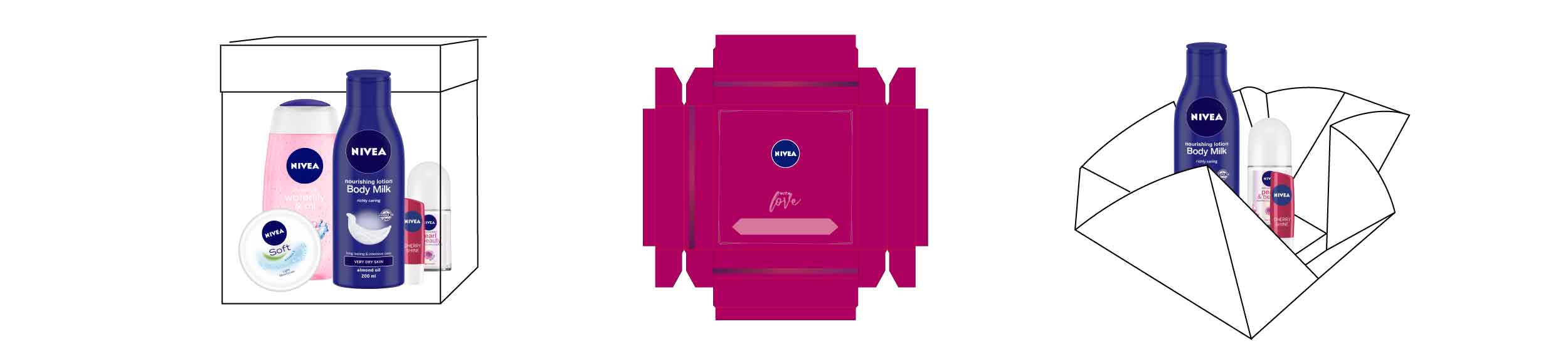
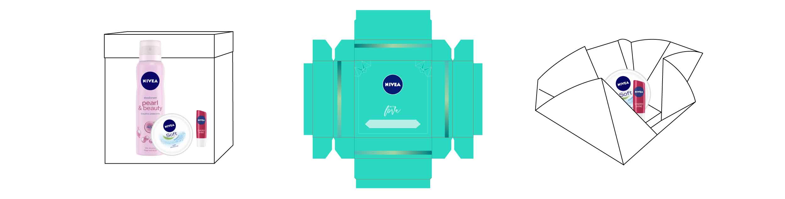
We dove into the design process by looking at the shape of the bottle and developing an information hierarchy that clearly conveyed the usage of each product.
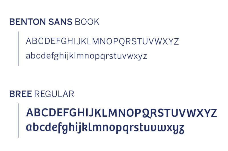
As this was the first time Nivea was launching a milk-based facewash in India, we created distinct typefaces for ‘FACEWASH’ and ‘MILK DELIGHTS’ and placed them clearly on the label. As part of our communication, we had to ensure that the skin type the product suited was also clearly visible and the resulting effect of the product stood out.
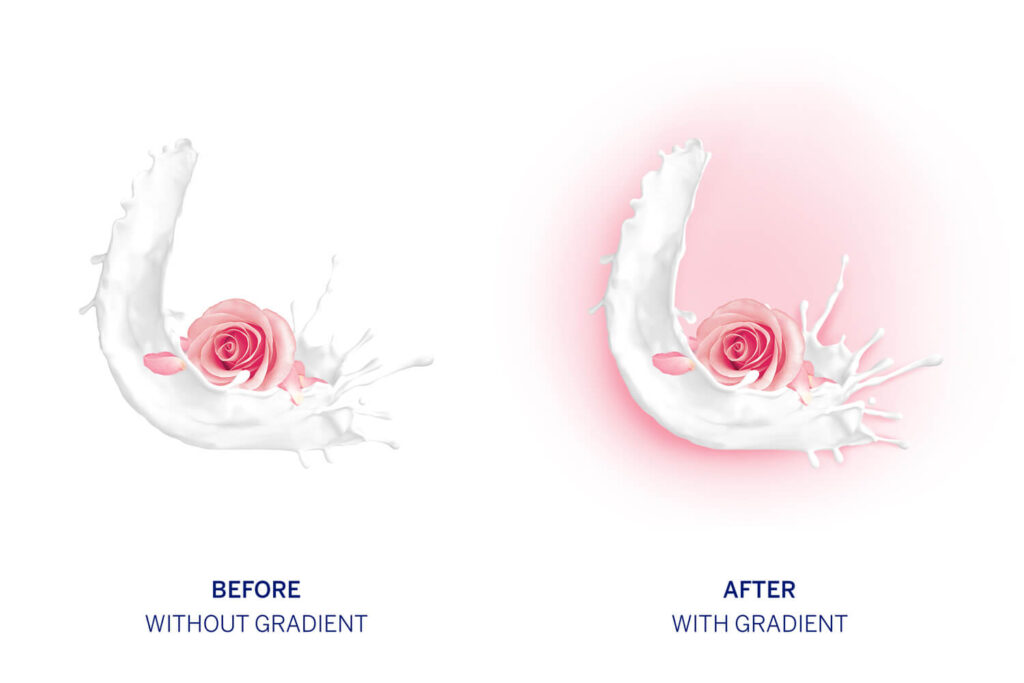
The white colour and shape of the bottle was also something we leveraged through our designs. By adding gradients and splashes of colour, we successfully highlighted the ingredients used in the product as well as brought out the fluidity and viscosity of the milk – the core element in the product line.
We now wanted to bring out Nivea’s core positioning which is that every product cares for the consumer, and to shine the spotlight on home remedies. To bring these thoughts together, we used the splash of milk as a cradle for the core ingredient, just as a mother cares for her child, and Nivea cares for you.
Our final challenge was to play with the colour of each product’s bottle cap. After exploring multiple options based on the ingredients, we chose to stay true to Nivea’s brand language and go back to the traditional blue caps that are symbolic with Nivea’s products worldwide.
Today, Nivea Milk Delights, with our clean, bold and evocative designs have flooded brick and mortar stores as well as e-commerce platforms across India.