JUPITER // Brand Building

Project Year

2021

Client

Jupiter

Project Type

Brand Building

Location

India

CHALLENGE:

Neo banks or digital-first banks were as new to us as they were to India. The challenge was to build a brand around the name, and get people to switch from traditional banks.

OUR STRATEGY:

We started by looking at the current banking landscape in India. By and large, they were still focussed on traditional ideas such as saving for the sake of saving, and not for your goals. 


Outside India, we looked at players and learnt that they were all about challenging the status quo—and giving consumers a better option.


Eventually, we realised that the consumers to whom our product would appeal the most were digital natives and young adults (24 – 34)—people who felt intimidated by traditional banks.


The insight was that Indian consumers were not necessarily unhappy with their banks. We needed to create tension and build a brand that would fit into this young consumer’s life.

POSITIONING:

Banking that keeps pace with you.

VERBAL LANGUAGE:

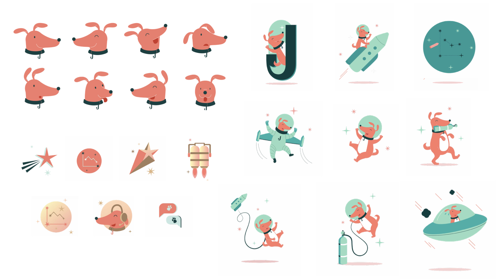
To bring the positioning to life, we associated Jupiter as a wingperson, someone who stays by your side and nudges you along through this new journey of banking.


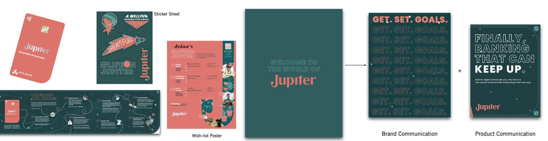
For our Tone of Voice, we wanted to be approachable, energetic and humour-friendly. One of the main guidelines was to talk like the user, and minimise complex banking jargon. Inspired by the name, we leaned into space as a theme and built #LifeAtJupiter

VISUAL LANGUAGE:

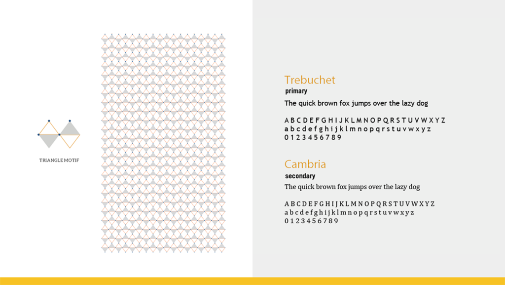
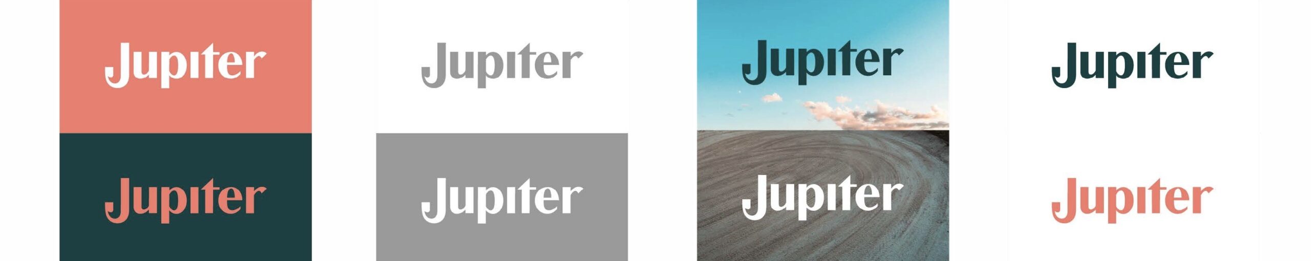
Our logo wordmark features a strong contrasted Sans Serif typeface that cues a feeling of trust. The ‘J’ is in upper case to signify the idea of making the most of your money. It also is in a distinct form which makes the word mark memorable—symbolic of a hook, one that is always with you.


The illustration is a simple vector style that cues friendliness and communicates the message clearly. Additionally, we created a library of graphic forms using the J for icons and the debit card design to build the story further. 


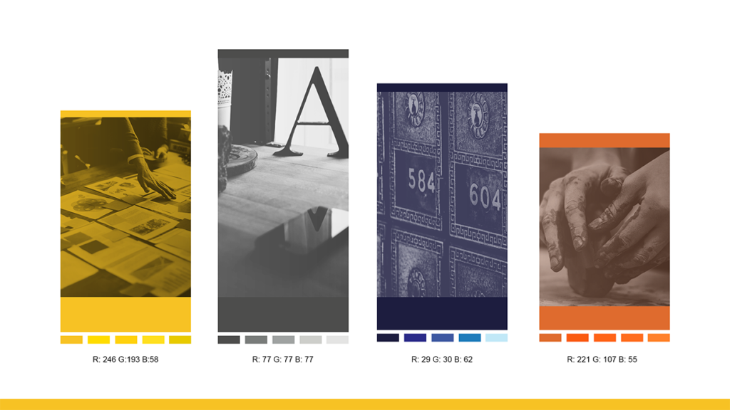
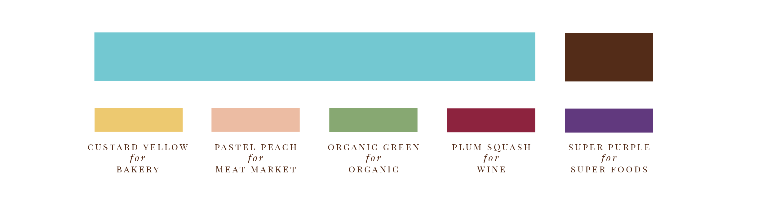
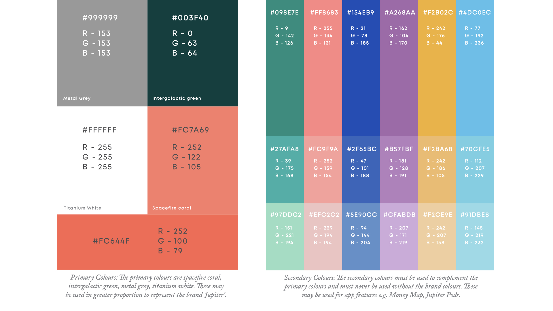
The primary colours are Spacefire, inspired by the planet’s red spot, and Intergalactic Green to contrast it.

ICONOGRAPHY:

Like every other area of user experience design, an icon in the interface should serve a purpose. When done correctly, icons can help guide users intuitively through a workflow without relying on too much copy.


Our iconography is connected to our typography at a fundamental level to maximize recognition and ownability. Hence, our icon system is inspired by the distinct form of our mark ‘J’.
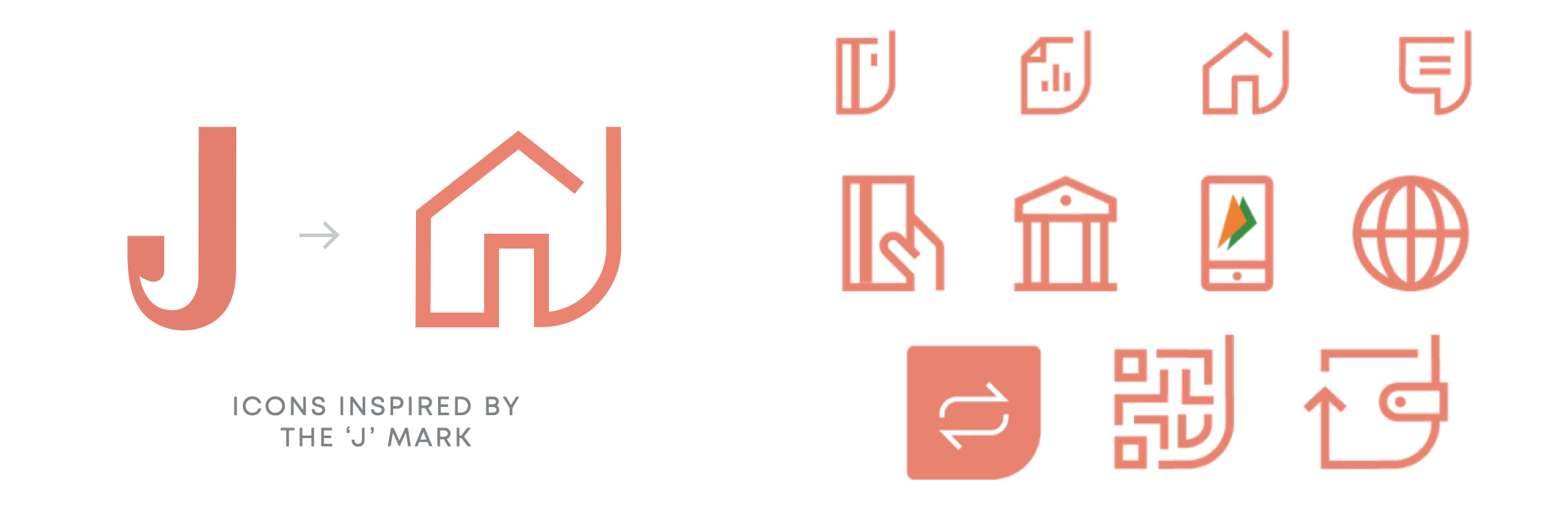
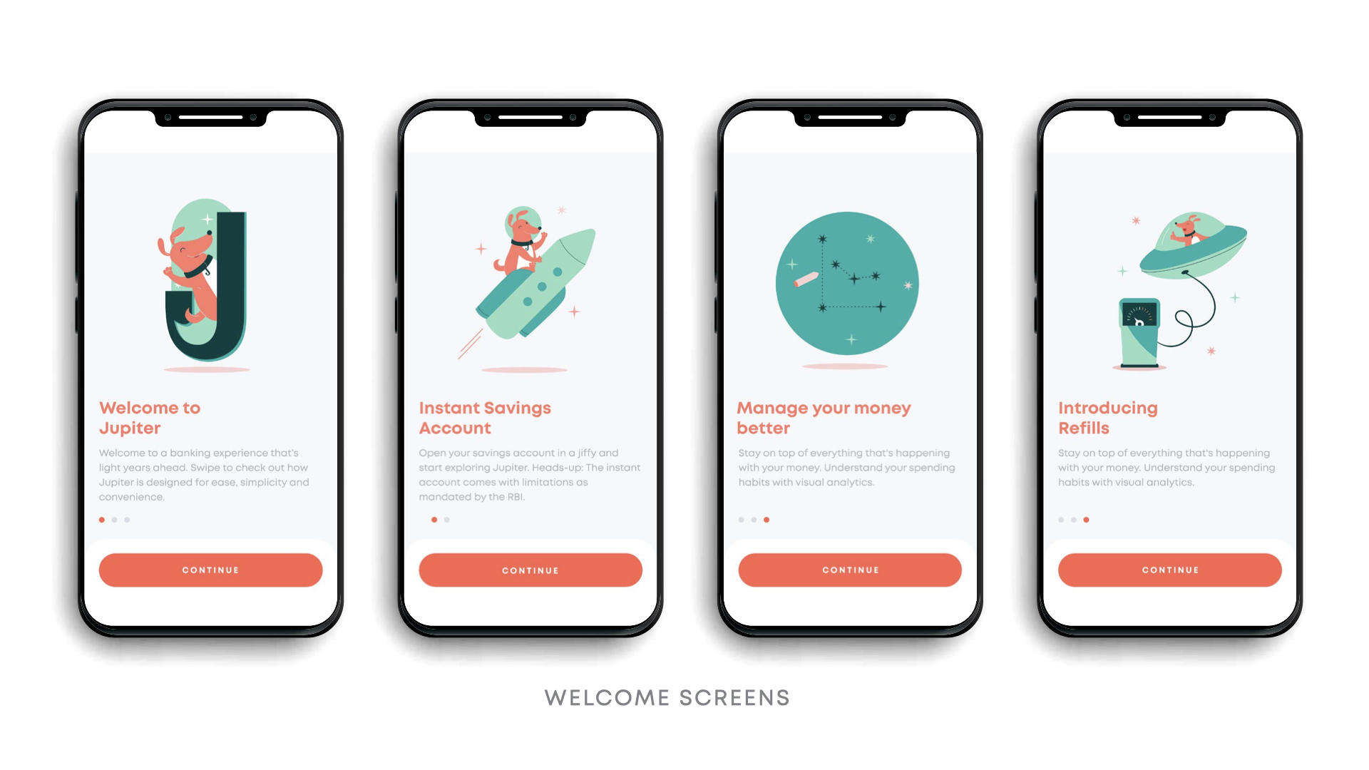
ILLUSTRATION STYLE:

The illustration style we set up is a simple vector style which is aimed at being friendly and approachable to communicate the message clearly and effectively.


The style also includes a friendly dog that helps you navigate through the banking features. It resonates with the ‘explorer’ archetype and the style gives one a sense of a happy companion in a relatively impersonal digital space.

EXPERIENCE:

For the launch, we created a Parcel from Space, a kit that featured the Spacefire debit card along with merchandise. The idea was that this kit came straight from Jupiter, and held all the key tools a user would need to kickstart their banking journey including a comic featuring the know-hows.

FALCON// Brand Building & Web Design

Project Year

2022

Client

Falcon

Project Type

Brand Building & Website

Location

India

WHAT DID THE BRAND NEED HELP WITH?

Falcon’s cutting-edge technology enables companies to go to market with their fintech products in as little as a day. They are creating the future of money. 


To establish themselves, Falcon approached us to create a brand identity and website as powerful as their platform, that speaks to both traditional and new-age businesses.

How did we help them with that?

As Falcon deals with money, the identity had to cue trust and expertise, while at the same time, being contemporary and bold. To achieve this we tapped into the mindset of growth often found with new businesses. 

Positioning

We locked in “Built To Build With” as our tagline, which symbolised collaboration and expertise but also established Falcon as the building blocks for their clients to build upon. 

The Design & Brand Language

The “F” shaped logo was inspired by the form of the falcon bird with emphasis on its beak. 

Falcon Favicons: Our favicon is a simplified version of our logo. It appears as a thumbnail in browsers next to the Falcon website address. We use it as a substitute for the logo when we want to have more fun with the mnemonic.

Shades of blue, white and black were selected to bring in trust and expertise while maintaining a confident personality. A fluid mesh gradient cued the dynamism of the brand and plays a vital role across communication.


The iconography and illustration style are a combination of 3D and geometric shapes. By layering colours and shapes we brought in the idea of Falcon’s highly customisable stack.

Innovation Meets Website

With Falcon set to disrupt the industry, our challenge was to create a website that is equally innovative and future-forward. As the website is the brand’s primary digital touchpoint, this could only come to life using the latest technology, WebFlow. 

Expanding on our tagline, “Built To Build With”, we created isometric blocks to represent our core offering and convey key USPs. With a wide range of offerings comes an equally extensive set of icons made with geometrical shapes and sharp corners.     

Building Interaction

Heroing the movement and interaction played an important role to build intrigue. The visual assets transformed as one navigated through the website, reflecting key information with every scroll. We then added a layer of micro-interactions and animations to make the experience more engaging. 


This resulted in a responsive website that was disruptive for an audience eager to take on the future of fintech.       

MAD OVER DONUTS// Brand & Packaging Design

Project Year

2021

Client

Mad Over Donuts

Project Type

Rebrand

Location

India

Research & Strategy

As we set out to study India’s sweet scape, the client’s business objective was threefold: 

  • Find and tap newer consumer segments 
  • Drive in-store sales
  • Communicate their wide product range 


The first step in our research was setting up camp across different MOD store formats, observing and outlining consumer decisions while simultaneously staking out other stores in the same category. The second, surveying tons of donut lovers which revealed a shift in sentiment: donuts were no longer a novelty, but a daily delight and consumers had moved on from chocolate to include more sophisticated flavours. 


Research revealed a new audience— 21 to 28-year-old young adults, who we realised had the most ability to spend, ordered in a  ji nd ate out the most, had the autonomy of decision making and could also be targeted for multiple occasions. Though they became our prime audience, we needed a strategy that wouldn’t alienate our loyalists: kids, college students and corporate individuals. 


Armed with our new discoveries, we wanted MOD to be known for casual treats, stay true to its category and take on the more playful archetype of ‘Jester’—with most dessert brands already crowding the ‘Lover’ archetype and few occupying this space.


To speak to this new consumer (who actively seeks joy in the everyday or indulges in daily delights) we homed in on a strategy that hit the sweet spot. We repositioned Mad Over Donuts from ‘affordable indulgence’ to an ‘everyday treat’ and arrived at the brand idea of amplifying everyday or no-occasion celebrations.

Brand Building

A new positioning in place, our first step was to structure the brand into 3 pillars: 

Freshness. Flavour. Fun. 

These three core principles would come to guide the entire brand experience across all touchpoints. From store design to in-store display, the ordering and delivery experience to packaging and gifting, every aspect of the customer journey was re-moulded on one of or all three of these pillars. 

     
Verbal Language

When developing a new verbal language, we looked to MOD’s audience and offering and decided on a voice that is fun, playful, witty, and conversational. We took the core idea of amplifying happiness and celebrating the everyday across communication, especially while renaming their menu and creating their packaging. Each flavour got a fun story of its own, the menu was segmented into “Donuts” and “Not A Donut” and the in-store communication became far more conversational. 

As the most consumer-facing touchpoint, their boxes now stood for the occasions they were bought for—⁣the Triple Treat Box (3), the Perfect Party Box (6) and the Super Celebration Box (12).

Design

The New Shape Of Happiness 

With drawings of donuts covering every inch of the office and plenty of taste tests later, ⁣we finally drew up a mark that stemmed from our 3 pillars and represented the new brand. ⁣

Our research showed us that Mad Over Donuts was mostly referred to as ‘MOD’ so we chose to spotlight the abbreviation in our logo as opposed to the full name. 

  • To signify fun, we retained their signature orange and brown but gave it new life by switching the tones to their brighter, more energetic avatars.
  • For flavour, we cued the hero product, donut and played with the ‘O’. 
  • And for freshness, the imperfect ring signified the brand’s key offering: fresh, handmade treats.⁣
     
     
Visual language

The brand’s previous language was complex- evoking softness, love and indulgence. 

For the all-new MOD, we grew the brand’s visual assets to be fun, fresh and have universal appeal so as to not alienate our loyalists. 

The new palette is dominated by orange, our strongest visual asset with immense recall value, and includes purple as its secondary colour, with tertiary hues being yellow, teal and soft pink- that cue both confectionary and vibrancy when paired with orange or each other. 


For the typeface, we chose a universal one that MOD could own- Quicksand being our final choice. We found that its soft edges and round corners, yet clean and bold features offered us enhanced visibility across offline touchpoints like facades and menu screens. 


Illustration also became a big part of the brand’s new direction and we created two distinct styles- one to be used for flavours and toppings and the other to communicate the brand’s story and packaging concepts. 

     
Thinking outside and inside the donut box 

Packaging is MOD’s biggest consumer touchpoint and the main problem was the format of the boxes. Most MOD donuts are heavily topped and often, the top of the boxes touch the donuts, therefore ruining the donuts and the customer experience. To tackle this challenge, we created collapsible handles for every box, so delivery executives would know how to handle it and keep the donuts intact. 

For the packaging design, we used our flavour illustrations on our hero boxes of 3, 6 and 12, intending to change the flavour every month so consumers begin associating MOD with those beyond chocolate. Each flavour design came with a flavour story in the corner, and a fun line of copy to delight consumers. We also introduced the “box of 1” based on the insight of personal and corporate consumption and separate hot & cold takeaway beverage cups. 

A Truly 2020 Launch 

With the onset of the pandemic, we knew it would be some time till donut lovers could come see their new MOD—so we decided to take it to them! MOD’s audience online is young, fun and always on-trend and when we planned a digital launch of the rebrand (the first of its kind), we played to the platforms’ strengths.  


We built up the excitement for a few days before throwing a launch party with the new key message of “Biting into happiness”. It kicked off with a catchy launch video showing the audience MOD’s new energy, look and feel while making sure to communicate that their old favourites weren’t going anywhere. We created a Green Screen background of a virtual MOD store that customers could post on their stories to line up and celebrate, as well as a 15 post grid that mimicked what a new store would feel like- including the new facade, the most loved products and finally the counter with a warm illustration of the staff introducing a celebratory offer. 


To add to the festivities we created custom MOD GIFS (that you can find if you type ‘mad over donuts’ into Instagram’s GIPHY bar), and a “Bite into Happiness” post-launch digital campaign to drive home the key message of everyday celebration.

—-

The opportunity to re-brand one of the country’s biggest brands was phenomenal, but it was the joy of designing happiness that makes what we do, what we love. 


SHUNYA// Packaging Design

Project year

2021

Client

Mad Over Donuts

Project type

Packaging Design

Location

India

What did the brand need help with?

Shunya is a 0 Calorie, 0 Sugar, 0 Artificial Sweetener drink. Inspite of this drink being the answer to all our health prayers – consumers were not flocking to the stores and grabbing them off the shelves. Shunya needed to communicate great taste and unbelievable good health in a bottle.

How did we get our hands dirty?

Part of what we did to launch Shunya, was to get on the streets and get consumers to try the drink.
We designed a Shunya Jeep – hopped on and drove all over the city to get the drink in consumers hands.

From burger joints in Delhi to corporate football matches in Bangalore to Joggers park and Lower Parel in Mumbai – we spoke to consumers and understood what they loved.

– A hydrating drink for health and sport
– A fizzy drink for fun and indulgence


Where did we sow the seeds of smart design?

Branding the hydration drink Shunya Go – alluding to an active lifestyle, a trend we see growing at an increasing rate.
This also created a need for the product in consumer’s everyday.

We changed the bottle to make it smaller and more on the go. And the design brought up more of the ingredients, as active health cues.


The carbonated drink was branded Fizz – to cue in fun and excitement. With Fizz, we played with gradients and neon to amp up the desire and attractiveness – we also created a dream like feeling on the can, to bring out the unbelievable-ness of the drink.

The typography took us to a retro cool space, to be more trendy with todays aesthetic.


Has the brand moved any mountains?

Over the last 9 months we helped establish the brand with the previous packaging. We took this time to learn the market, support the client in building their team and distribution network.

With our new packaging, new distribution model, digital marketing, new brand language and GTM strategy in place, we are now poised to get these products in everyones homes.

     
What were the things we did for love?

We never gave up – when consumers didnt believe whats in the can or bottle, we convinced them by redesigning it. When they didnt love the after taste, we supported the client while they enhanced the flavours. When they didnt know when to drink it – we set up occasions to do so.

We helped design health to look cool.


BLUE TOKAI// Packaging Design

Project year

2021

Client

Blue Tokai

Project type

Food & Drink

Location

India

What did the brand need help with?

Blue Tokai was venturing into a new territory. They created a product for the supermarket shelf, the first time any of their coffees would be sold outside their chain of cafes or website.


They approached us to help extend their current brand language onto this new product packaging.

How did we get our hands dirty?

Based on our research (which also involved hours at various supermarkets) and strategy, we expanded the scope of the product, to compete with other premium coffee brands on shelf. This would help us widen Blue Tokai’s consumer base.

To compete on shelf, (both digital and physical), we pushed the brand to use more colour in the packaging, in order to stand out. A first for the brand.

Where did we sow the seeds of smart design?

Blue Tokai had the advantage of being a trusted brand, a trust they’ve established through their cafes. We leveraged this promise of quality by extending their existing design language on the box.

We then played up the word ‘Easy’ in the communication so as to cue convenience in the mind of the consumers. Not just convenience, but also that they were bringing quality to their homes and offices by getting the Easy Pour.

Has the brand moved any mountains?

The Easy Pour had a timely launch that coincided with the lockdown. As a lot of consumers brought the Easy Pour home the sales outdid their expectations.

What were the things we did for love?

To tell this rich story of provenance, process and taste, we focused on the illustrations and colour of the packaging. We combined Gond and Kalamkari styles into one artistic composition that echoed the beauty of Indian coffee farms.

PARLE ROLA COLA// Digital Campaign

Project year

2021

Client

Mad Over Donuts

Project type

Packaging Design

Location

India

How do you rekindle the love of a nation for a simple cola flavoured candy?
   
WHAT DID THE BRAND NEED HELP WITH?

Parle’s Rola Cola was a much loved candy from our childhood that was no longer in circulation. On Twitter, a loyal fan asked us what he would need to do for the brand to bring the candy back into circulation.

We set out an attainable task. If he garnered enough love for the candy online, we’d get Parle to re-launch Rola Cola.

WHERE DID WE SOW THE SEEDS OF SMART DESIGN?

We asked our loyal fan to gather 10,000 re-tweets in order to bring back the candy. The number was carefully selected, as it was attainable, but yet slightly out of reach. It would take a few months to reach this digital milestone (re-Tweets) and in that time Parle could get production started.

Most of all, consumers now felt they had a say in this candy being available – they had a sense of ownership in the process of reviving it.

     
HOW DID WE GET OUR HANDS DIRTY?

It was not about reaching the number, but about the journey. We pushed consumers along, enticing them to keep the excitement alive. The feeling of almost reaching that number.

Our campaign was focused on showing consumers how close they were to making it happen – bringing back their beloved candy! Their hard work was paying off.

HAS THE BRAND MOVED ANY MOUNTAINS?

The product is out in the market, it’s selling very well, and consumers feel like it’s their own candy. The transition from nostalgia to a new (updated) Rola Cola has allowed us to be relevant to the newer, younger consumers as well.

     
WHAT WERE THE THINGS WE DID FOR LOVE?

This campaign was built on love. The love for this candy, and the love for our childhood. For quite a few fans that showed us love online, Parle sent them a Rola Cola care package as a thank you.

The person who tweeted first was the first to get his hand on the updated Rola Cola.

IIFL// Rebranding

THE BRIEF:

IIFL, launched in 2008 had grown to become the leading wealth management company in India, and by 2015 had built 7 additional subsidiaries offering various financial services. Our task was to create a distinct identity for the parent brand IIFL Wealth, as well as a language that could be adapted to all its subsidiaries.

Project Year

2016

Client

IIFL

Project Type

Banking and Professional Services

Location

Mumbai

The Problem

With IIFL’s rapid expansion, we noticed that all the subsidiaries had grown in isolation, lacked consistency in brand language, and required an overall brand architecture.

There was also a gap between the services offered and the positioning that IIFL Wealth was communicating to its clients. The brand had premium offerings, and multiple subsidiaries providing more than just wealth advisory services, however, these offerings were not branded or communicated clearly.

The Approach

Our goal was to give IIFL Wealth a strong brand positioning and identity that communicated its values and proposition to external clients as well as internal stakeholders.

We also decided to design a brand architecture for all its subsidiaries. One that gave them a distinct brand language and voice of their own, but still stemmed from the same roots as the parent brand.

Another element we analysed was the name of the brand. Since it was offering more than just ‘wealth management’, we needed to give it a name that encompassed all the financial services the brand offered.

The Solution

We began by analysing all the services IIFL Wealth offered in order to come up with a name that encompassed them all. Since the services ranged from Wealth Finance and Trustee Services to Asset Management, we settled on the name ‘IIFL Wealth & Asset Management’.

We also designed a logo for this brand that would then be adapted into the brand architecture for each subsidiary. We used a deeper blue to bring out the strength and sophistication of the brand while using a more contemporary typeface that emphasised progressiveness and confidence.

We then moved on to the visual and verbal language for the brand. With regard to the typography, we chose sleek, elegant and contemporary typefaces to make the brand more modern, sophisticated and approachable. We also used shades of blue, orange, yellow and grey to evoke a sense of positivity, authority and practicality within clients.

Since IIFL Wealth & Asset Management was here to make wealth management easier for their clients, we ensured our verbal language was smart and professional, while still remaining inspiring and emphatic. This made the brand knowledgeable and experts in their field, but not one that is overwhelming to the consumer.

As the brand’s positioning and core beliefs were not clearly defined, we dove into IIFL’s brand wheel to analyse its ethos and brand values. Defining these was key for us to start establishing the new positioning for the brand. After carefully analysing what the brand stood for, we arrived at six core values: Transparency, Adaptability, Progressiveness, Expertise, Invested, Demystification.

These values now had to be clearly communicated both internally and externally.

The Capital Code

We therefore created The Capital Code. This brand brochure not only listed out the values and vision of the company for internal stakeholders, but was also instrumental in standardising the sales pitch made by IIFL’s sales team. It could be given to clients after meetings for further reference, thereby clearly communicating the values and proposition of the company to each stakeholder.

The Launch

The new brand was launched with email communications from senior management to the entire company, along with a letter from business partners explaining how the company had grown and why the change was necessary.

Branded stationery and other collaterals were left at employees’ desks, the walls were painted with the new brand colours and premium looking logos adorned the organisation. We also designed new office posters, standees and banners to create more of a buzz. This generated a lot of excitement about the rebranding and ushered in a new and prosperous phase at the company.

NIVEA MILK DELIGHTS// Repackaging Face Wash

Project Year

2018

Client

Nivea

Project Type

Fashion & Beauty

Location

Mumbai

The Background

Nivea, commonly known for their extensive product line of creams, lotions, body washes and moisturisers, was in the process of introducing a brand-new product to the Indian market. This new product was a milk-based face wash; something the brand had never brought to India before. While most face wash bottles used the conventional tube-like shape, Nivea experimented further and designed the bottle to look like a drop of milk.

Our task was to design the bottles, while ensuring all the relevant information stood out and consumers understood the use of the products.

The Research

Nivea, through extensive research, had noticed that young women in India preferred to use home remedies and known ingredients for all their beauty needs. However, while they had the knowledge and proclivity, what they lacked was the time – to source ingredients, develop recipes and finally apply the product.

When we dug deeper into the consumer, we noticed that Indian women aged 18-30 had specific skin care routines. While these regimens varied from one consumer to the next, each was firmly based on the user’s skin type. We noticed a stark difference between ingredients used depending on whether the consumer had dry skin, oily skin, sensitive skin and so on. This was an important element almost unique to the Indian consumer and had to be taken into consideration when designing the final product.

The Design

We dove into the design process by looking at the shape of the bottle and developing an information hierarchy that clearly conveyed the usage of each product.

As this was the first time Nivea was launching a milk-based facewash in India, we created distinct typefaces for ‘FACEWASH’ and ‘MILK DELIGHTS’ and placed them clearly on the label. As part of our communication, we had to ensure that the skin type the product suited was also clearly visible and the resulting effect of the product stood out.

The white colour and shape of the bottle was also something we leveraged through our designs. By adding gradients and splashes of colour, we successfully highlighted the ingredients used in the product as well as brought out the fluidity and viscosity of the milk – the core element in the product line.

We now wanted to bring out Nivea’s core positioning which is that every product cares for the consumer, and to shine the spotlight on home remedies. To bring these thoughts together, we used the splash of milk as a cradle for the core ingredient, just as a mother cares for her child, and Nivea cares for you.

Our final challenge was to play with the colour of each product’s bottle cap. After exploring multiple options based on the ingredients, we chose to stay true to Nivea’s brand language and go back to the traditional blue caps that are symbolic with Nivea’s products worldwide.

Today, Nivea Milk Delights, with our clean, bold and evocative designs have flooded brick and mortar stores as well as e-commerce platforms across India.

FOODHALL// Brand Building

THE PROBLEM:

Over eight years, Foodhall had established itself as THE luxury food retail destination in Mumbai, Delhi and Bangalore. However, competition grew strife and new players in the market challenged the standard set by Foodhall, the brand that spawned the competition. We had to think of a way to help Foodhall raise the bar for premium retail with new strategy and reclaim its position once again.

Project Year

2017

Client

Foodhall

Project Type

Retail

Location

Mumbai

The Solution:

Our goal was to build a consistent and elevated brand language for Foodhall to enhance the overall shopping experience, while also to create systems that were easily replicable across Foodhall’s brands and services.

Building the Design and Brand Language:

To tackle this mammoth brand, we created systems and adopted a step-by-step approach to the revamp. To build up Foodhall as a whole, we had to first elevate its parts. Our task, as we saw it, was to:

1. Build the brand

2. Create an expression for the brand

3. Work on extensions of the brand

4. Create identities and a language for the brands and services by Foodhall

Nothing communicates the love of food more than the vocabulary of food. Our first step was to craft a folklore for the brand that conveyed Foodhall’s values and the quality of its offerings. The next step was to update their pledge that reiterates Foodhall’s promise of curating the finest ingredients and experiences for its food forward customers.

We extended this vocabulary to the store directory, which we fashioned after a recipe. We broke up the sections in the store in the way a recipe is broken down, thus making an immediate connection with the act of buying ingredients and the act of cooking.

We simultaneously worked on a visual vocabulary capitalising on the vibrant colours of food for brand posters. To highlight the range of ingredients and the possibilities they present in the kitchen, we created pairing posters dominated by vivid photographs of stunning dishes with a stylised ampersand that conveyed our message in a subtle and elegant way.

Setting Up Systems:

Once the visual and verbal styles were set, our focus was to delve deeper into the consumer journey. To this end, we created a system of templates to announce new products and services in the store, educate customers about the uses of niche items, and encourage sampling within the store to boost sales.

Setting up the Flagship Store:

In December 2018, we launched Foodhall’s newest store that was set to redefine food retail in India. Spread out over 25,000 square feet and rising four floors high, Foodhall@Linking Road consisted of its own café, restaurant, coffee lab and cookery studio, not to mention over 8,500 high-quality ingredients.

The replicable systems we had set up, and the brand language we had developed allowed us to lay emphasis on everything from the overall store design and in-store experiences to looking at business opportunities for individual product categories and Foodhall brands.

Today, Foodhall has recorded its highest sales since its inception, with in-store revenues increasing by 20-30% and Café sales growing by 30%.

LIGHTBOX// Website Design

The brief:

Lightbox, a VC firm based in Mumbai approached us and asked us to design their website for them. We were given a few basic guidelines – keep it clean, clear, minimal and convey all the required information in an easily legible format. While the brand’s language had already been established, we still had room to play with regard to the design and layout of the website.

Project Year

2017

Client

LightBox

Project Type

Banking and Professional Services

Location

Mumbai

The Solution:

After analysing several venture capitalist firms’ websites, we had two major takeaways – the information was cluttered, and the communication lacked a personal touch.

We immediately realised that our website layout would have to stand out. To accomplish this, we decided to use muted colours such as beige, black, white and light blue, all so that our communication remained bold and easy to read.

Highlighting Lightbox’s expertise and experience was crucial to build credibility. To make this stand out, we kept Lightbox’s ‘Portfolio’ page as uncluttered as possible. Each client had a short right up and further information could be accessed by clicking on the thumbnails.

Blogs regarding recent trends, business models and information about the market were also a vital way for Lightbox to convey their expertise. We soon realised however, that visitors on websites prefer not to scroll through text with no end in sight. We therefore added ‘the average reading time’ to each blog so that viewers had an idea of the length of the article before opening it.

Once the layout and functionality of the website took shape, we had to make the communication more personal and the team more approachable. We decided to include a ‘Team’ page that allowed viewers to read detailed write-ups about each member of the Lightbox family from their work experience to their personal ambitions. We also let viewers contact the team on their work email IDs.

This shifted Lightbox from your average VC firm to an approachable and experienced group of individuals who were interested in helping entrepreneurs grow their businesses. To truly drive this home, we included a ‘Pitch us’ page where entrepreneurs could easily tell the Lightbox team about their venture and then take the investment process further.

Lightbox Today:

Five years and over $100 million later, Lightbox stands as a unique VC firm not solely interested in maximising profits, but in closely collaborating with entrepreneurs to build successful businesses.