CINCIN// Wine Book Design

Defining the problem:

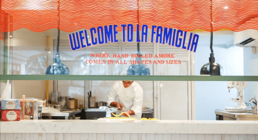
Along with being known for their hand-rolled pastas and Italian small plates, CinCin also has an extensive wine list and was in the process of launching their very own house-wine. Our job was to build the concept of wine, not as a drink for the discerning, but as an easy beverage that effortlessly blends into every meal.

Project Year

2018

Client

CinCin

Project Type

Hospitality

Location

Mumbai

The Solution:

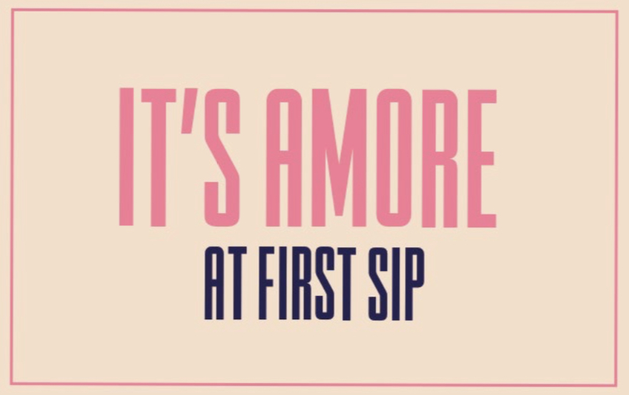
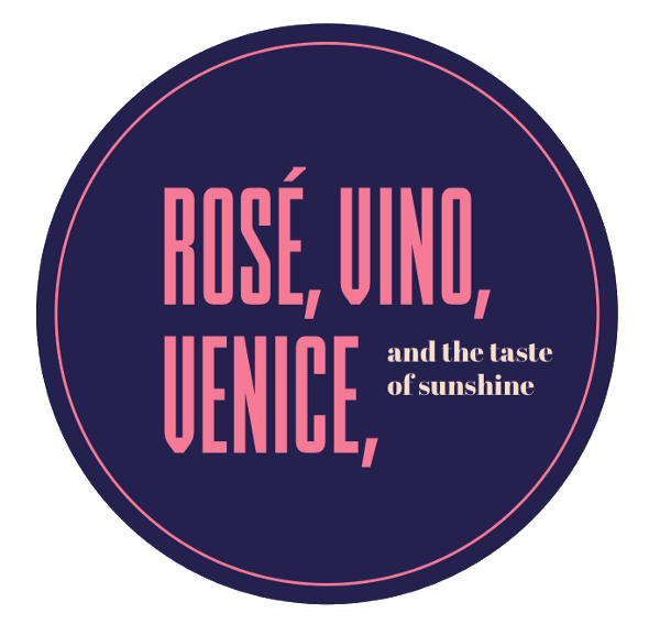
Our idea was to position CinCin as everybody’s go-to wine bar. We therefore decided to create a special wine menu titled, “More vino, per favore”, or “More wine, please”.

This menu was designed to meet 3 objectives:

1. To make wine more approachable.

2. To highlight CinCin’s wine collection.

3. To introduce the world to CinCin’s very own house wine, the CinCin Rosso.

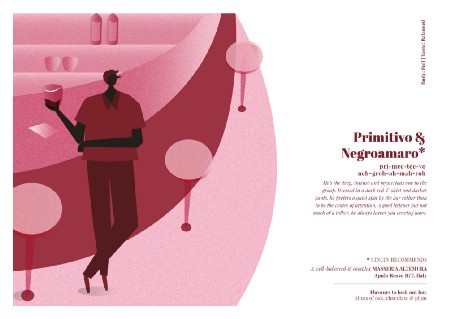
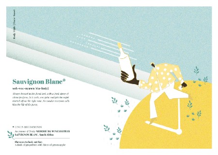
To accomplish this, we personified 10 of CinCin’s most popular wines and the CinCin Rosso, based on flavour notes, aromas and the overall feeling the wine offered its drinker.

Our Process:

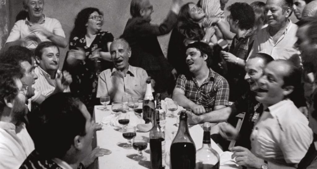
Our research showed us that India especially, is not a wine-drinking nation, and as we delved deeper into wine culture and etiquette, we realised that wine still remained desperately unapproachable. We needed to create something that was enjoyable, light-hearted and relatable — just like CinCin is.

The concept we arrived at was succinct, subtle and in line with the brand ethos — If you were a bottle of wine, which one would you be?

What we had to keep in mind:

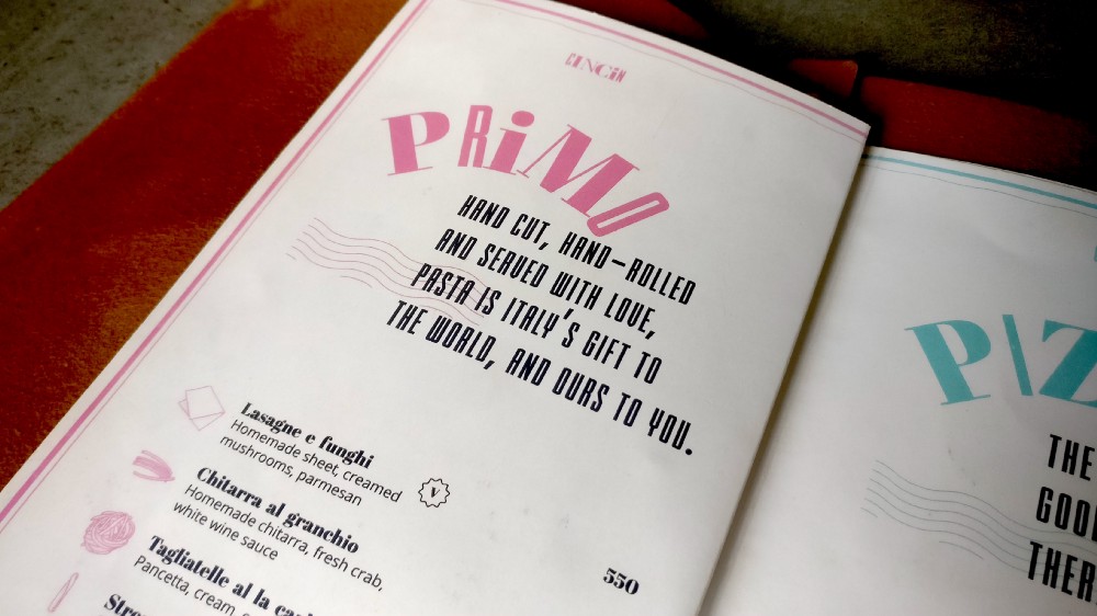
Since CinCin is a portrayal of Italy that is more the Amalfi Coast on spring break than the Godfather, it was important for us to treat our designs and communication the same, making them fun, colourful and breezy. However, we had to ensure our menu offered guests some form of utility.

To solve this problem, we added in 2 significant elements:

1. A wine recommendation on each page

2. A bookmark that highlighted the prices of all the wines in the menu.
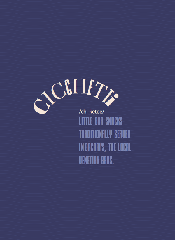
The Language:

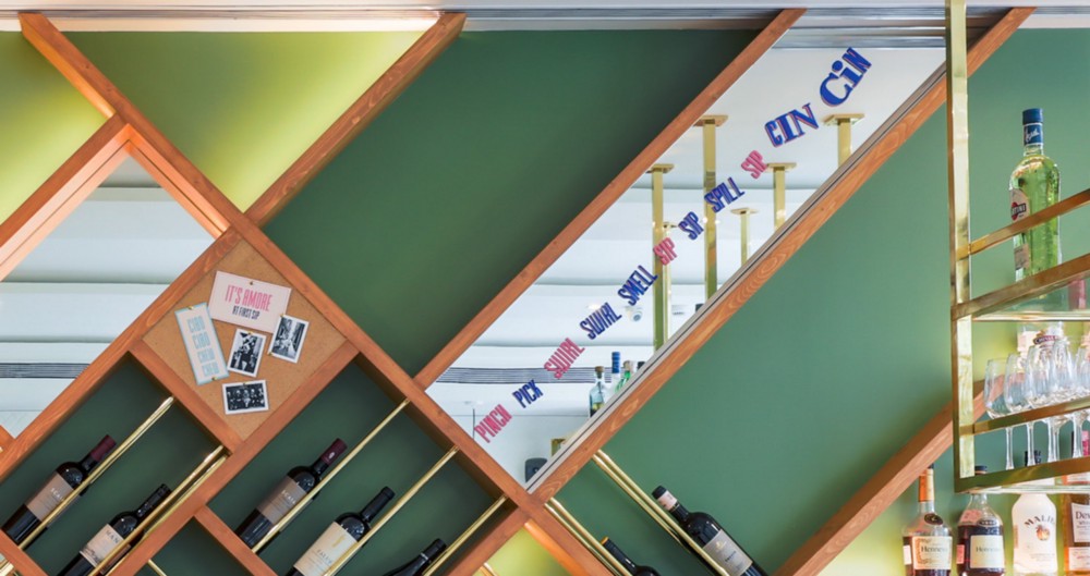
We ensured our communication was as young and playful as CinCin is, using a mix of fun Italian words, double entendres, alliteration and repetition. Even the tagline for the CinCin Rosso — ‘Que Syrah Syrah’ (a play on the term, Que Sera Sera) included elements of repetition and the use of puns.

The language was then extended to define the personality traits of the characters we created, from the wine label and the menu to everything that went in-store, all to build the experience.

The bright colours and hand lettered typography, have also been used to replicate the joyful feeling of sipping on the Rosso.
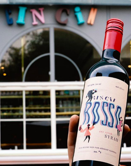
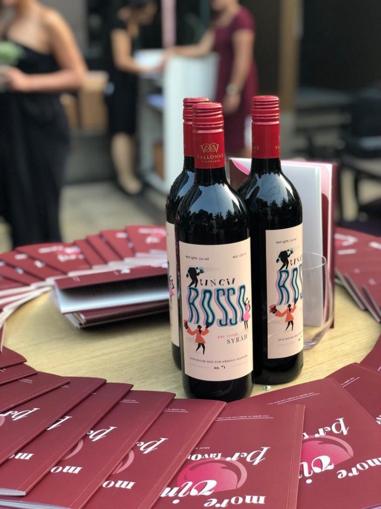
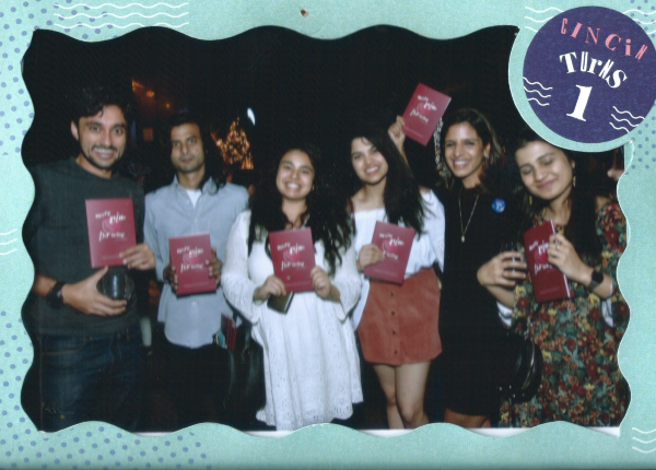
The Reveal:

We launched the wine menu and the CinCin Rosso at CinCin’s 1st anniversary party, where guests got a chance to interact with the menu and enjoy the wines featured in it. The ‘Guidebook to Wine’ played a huge role in increasing CinCin’s wine sales, and is now an intrinsic part of the ordering process at the restaurant.

CINCIN// Brand Building

THE PROBLEM:

CinCin, prounounced Chin Chin, is an Italian restaurant and bar that wanted to give Indians a taste of an authentic Italian experience.

OUR DIRECTION:

Unlike most brands that would use a foreign language to stay a cut above the rest, we decided to incorporate Italian in a more inclusive way, by giving pronunciation cues and even explaining how these phrases are relevant to everyday life in Italy.

Project year

2017

Client

Cin Cin

Project type

Food & Restaurants

Location

Mumbai

Our clients are well-established restaurateurs who cater to the discerning Indian customer with their brands such as Yauatcha, Hakkasan and Nara Thai, all of which are brands they have brought to India. When they wanted to build their own from the ground up, they approached us knowing our strength, which is to look at brands through a fresh and unconventional perspective.

When building out a restaurant concept, there are multiple directions we could have taken. We could focus on new types of Italian food — in this case cicchetti (Italian small plates). Or build out a traditional Italian pizzeria concept, where the consumer is transported to a time and place.

After numerous hours of research, deliberation and ideation, we drove the team to design out a feeling. The concept we set out to design, was a restaurant that provided a vibe that was energetic, exciting, passionate and fun. We aimed to serve the neighbouring corporate community with a modern and fun Italian experience, that resonated with the upwardly mobile.


This picture, says everything we wanted the brand to be

INSTEAD OF GOING THE TRADITIONAL WAY OF PORTRAYING ITALY, AS A GODFATHER MOVIE, WE WANTED TO SHOW IT FOR WHAT IT IS TODAY. FUN, EXCITING, COLOURFUL AND AUTHENTIC.

Keeping with that sentiment, our design broke away from the expected. Instead of using one font, we decided to use a variety of fonts to create the brand’s logo. The colours and the way the letters come together with different forms and shapes, depict the energy and movement of the brand. The individual letters were designed to represent various members of an Italian family, in all their shapes, sizes and personalities.

We wanted the logo (and everything else after) to replicate this essence of unconventional

Not only does the visual language stay true to the essence of Italy, but the verbal language too, incorporates Italian phrases in a fun and comical way.

Besides family, fun and vivacious energy, we didn’t want to leave out the sunshine, the sea and the assortment of food and wine that everyone thinks of when they dream of Italy. Although it wasn’t our main focus, you’ll find hints of all these things in our various designs.

Design patterns on the pasta counter are inspired by the waves of the
Amalfi coast and colours from the beach umbrellas

WE WELCOME CINCIN INTO PLEASE SEE’S FAMIGLIA OF RESTAURANTS!